

Over the last decade, marketers have watched as their industry has been turned upside down. According to research compiled by Hubspot, Digital media consumption increased 49 percent - and that's just since 2013. The small business marketing professional must stay in tune with marketing buzzwords, changes in SEO, data analytics, graphic design trends and new disciplines so they stay in the marketing game.
One piece of marketing that shouldn't be a struggle is your printed brochure. Your brochure is like a silent salesperson, a tangible tool to inform your customers, link them to your many forms of digital marketing, and ultimately leave a very important first impression.
One of the most common questions we get from clients who are getting ready to print a brochure, is "which paper should I choose?" It's a fair question because paper can be really confusing.
Fortunately, we have more than a hundred years of experience helping marketers get great results and we're here to help!
While many think of paper selection as the last step in a design cycle, it really should be one of the first. For example, if cost is one of your most important considerations, you need to opt for a design that works well with an inexpensive paper. On the other hand, if you are going for a distinguished piece on an unusual stock, having certain paper characteristics in mind will help you optimize your production and design.
What paper works best for brochures? The easy answer is that most brochures will look and feel good printed on 100 lb Silk Text. The weight provides just the right amount of heft to create a high quality feel without going overboard. The silk coating is light, has a silky feel, and makes photos pop while still keeping the text easy to read.
The longer answer is that "it depends," but here are three factors to consider to make the best selection.
A Weighty Matter:
Print is unique among marketing tools because it is tactile. The paper weight is important because it directly affects the way the user will physically interact with your brochure. Paper weight speaks volumes about whether a piece feels "cheap" or "high-quality."
How important is the tactile "feel?" Research shows a direct relationship between emotions and sensory stimulation. A brochure doesn't just accomplish this through our visual senses; touch is just as important. In fact, Small Business Chronicle noted, "the rich sensory experience created by tactile techniques engages consumers." Think beyond the look of your design. and engage them (your customer) with a "high-quality" feel.
Paper weight may also directly impact the overall cost of your project. Heavy paper costs more, but that doesn't necessarily make it better.
Here are some things to consider when choosing paper weight:
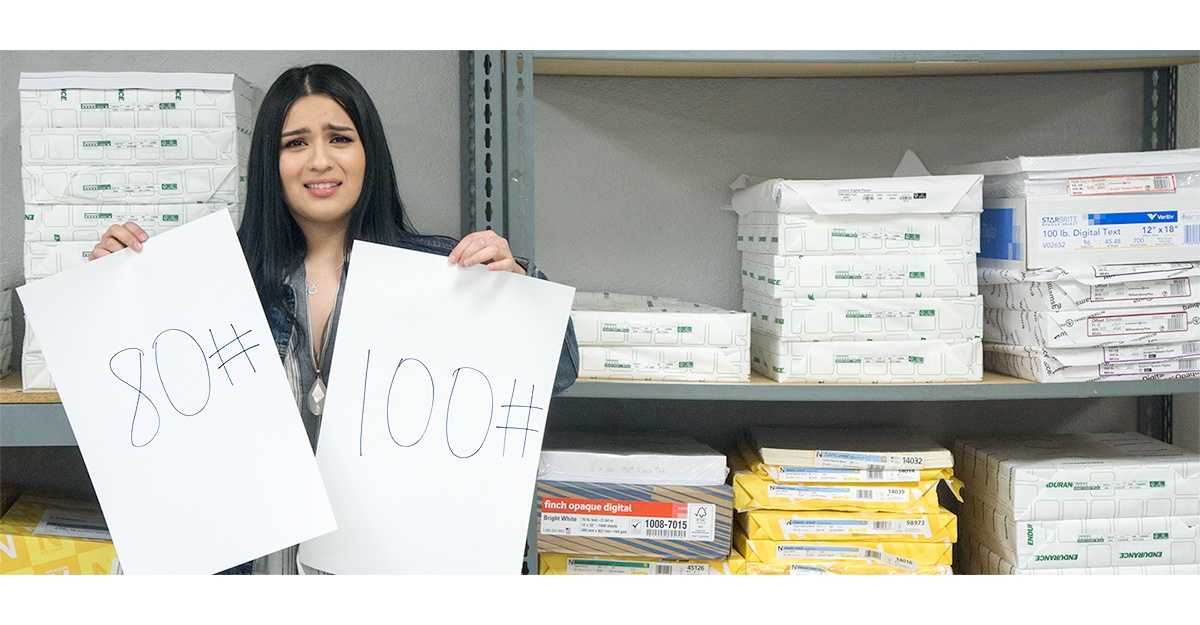
- Cost: If your budget is extremely tight, a 70 lb. text stock would be the most inexpensive route because it is the lightest we typically recommend for a brochure. Even though a 70 lb. text is doable, it's not usually recommended because it lacks the structural stability that even a slightly heavier stock like an 80 lb. text stock would provide. For example, think about the pages of a high end coffee table book or nice magazine, do you want your brochure to have the same feel? A 100 lb. text is usually the optimal pick if you want a high-quality look at a reasonable price. The paper feels substantial, leaves a good impression and works well for most standard brochure designs.
- Reader Experience: The structure of your brochure also plays a part in choosing the best paper weight. While a 70 lb. text stock is on the flimsy side, a sturdy 100 lb. cover stock could be too thick. Successfully using a heavier cover stock may be tricky and depends on the structure of your brochure; it can work for a bi-fold, but it's not usually recommended for a letter-fold or z-fold. Think about trying to fold a playing card three ways; it's just too thick and bulky, and may not be as pleasant for the reader to peruse.
- Purpose: If sales reps will be giving your brochure to potential clients in their office on sales calls, the 100 lb. text weight will probably be a good choice. Conversely, if they will be handed out at a trade show for attendees to stuff down in their bags with numerous other items, a cover stock like 80# cover might be a better choice because it will still look good the next week when it comes out of the backpack, briefcase, or shopping bag.
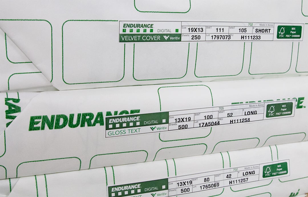
While most of the world measures paper thickness in Grams per Square Meter (GSM), in the US we use pounds. It is a cumbersome system, measured by weighing 500 sheets, at a specific "parent sheet" size, depending on paper type (text, cover, etc). This means that a 100 lb. text is actually less dense than 80 lb. cover because they have different parent sheet sizes. To make things a little easier, here are the most popular weights for brochures, in order from lightest to heaviest:
- 70 lb. Text
- 80 lb. Text
- 100 lb. Text
- 80 lb. Cover
- 100 lb. Cover
Coated vs. Uncoated Paper

Right behind the graphic design, coatings (or lack thereof) are important in creating the visual appeal of your brochure. While there are seemingly endless varieties of coatings, most marketers stick with gloss, silk, or just go with an uncoated stock; it really comes down to the look you are trying to achieve, the design, and your organization's brand. The coating you choose should fit your message and be incorporated in your design. Ask yourself who your audience is? Am I printing photos? Do I have a lot of text? How will my logo appear? Here's why these questions are important for each type of paper:
Gloss Coated Paper
Glossy paper often appears prestigious and reflects higher quality; it's great for pieces with a lot of photographs or other artwork. Why? Glossy paper doesn't allow the ink to be absorbed into the paper fibers. Instead, the ink stays on top, giving depth to the images. While this is great for photos and illustrations, if you have a lot of text in your brochure, it might not be the best call. A glossy stock will produce a glare that makes it hard to read.
Matte Coated Paper
Matte stocks tend to be the No. 1 pick for brochures with a mix of photos and text. You won't have the glare that comes with glossy paper, which makes your text easier to read. Furthermore, there's still enough shine to make your photos look great; it's the perfect compromise.
Uncoated Paper
Uncoated paper is a really popular trend right now, and that's driven by America's favorite generation to hate: Millennials. Like it or not, they will make up more than one in three workers by 2020 and Research shows that they want to buy from companies they believe have environmentally sustainable practices. Uncoated paper has a natural-looking, organic texture that reflects a low key, eco-friendly persona that helps to reach them.
In addition, according to Forbes, this rising generation in the workforce are also minimalists. To many, uncoated paper says "not too fancy," making it a good way to reach them. In addition, no coating means no glare - so this is definitely the best choice if your brochure is heavy on text. On the downside, uncoated papers don't provide the same look and feel for photos that a coated stock would, so your designer will have to keep that in mind.
Think Outside the Box
While brochures come in popular weights and coatings, you can think outside the box and go totally unique. To accomplish this, think about paper choice before your designer even gets started. Here are some unique ideas to really make your brochure engage the reader's senses.
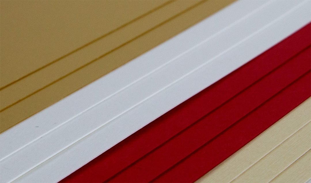
- Colored paper isn't what usually pops into your mind when you think of brochure design, but there are some options that will really give you a unique piece. Ask your printer if they can print with white ink. If they can, consider creating visual contrast by using white ink with a colored paper. Neenah is one of our favorite paper companies because they offer premium stocks in a wide variety of colors. Colored paper doesn't have to mean "bright" or "flashy" either; a "natural" or "off white" is a favorite of professional organizations such as banks and law firms.
- Pearlescent is a type of a coating and isn't limited to a creamy, pearl color; it basically means a paper with an iridescent coating, and comes in numerous shades. It will give your design a classy sparkle, much like pearlescent automotive paint. If you're looking to really create some impact with your printed materials, request samples from your printer.
- Special Textures can make your printed materials unique and enhance the tactile experience that it brings to the table. Some examples are super smooth, felt, embossed linen, vellum and wove. These all have varying textures from smooth to a subtle roughness to a very rough feel. Choosing one of these will add another dimension to your design.
There are endless options for your brochure. Good collaboration between your designer and your printer is essential. Talk to your printer before getting started and tell them about your audience, objectives, goals and potential brochure content. An experienced printer will be able to guide you to a great paper that will give you just the look and feel you are going for.
Need advice, or just need to order some great brochures?