


Whether you're a commercial graphic artist, or a small business owner who does their own graphic design, you have a lot on your plate. There are so many different mediums to design for, each with their own set of specifications. As you are likely aware, design for print has evolved quite a bit in recent years. Here are a few things to keep in mind to ensure that you get a predictable result.
Design Tools
They say you should always use the best tool for the job. When designing for print, this means using the following tools whenever possible:
- Adobe InDesign for Commercial Print Layouts
- Adobe Illustrator for Packaging Layouts, and for illustrations
Unfortunately there are not many consumer applications that do a good job in designing for print. One notable exception is Canva. Although it does have some major shortcomings, it does to a respectable job.
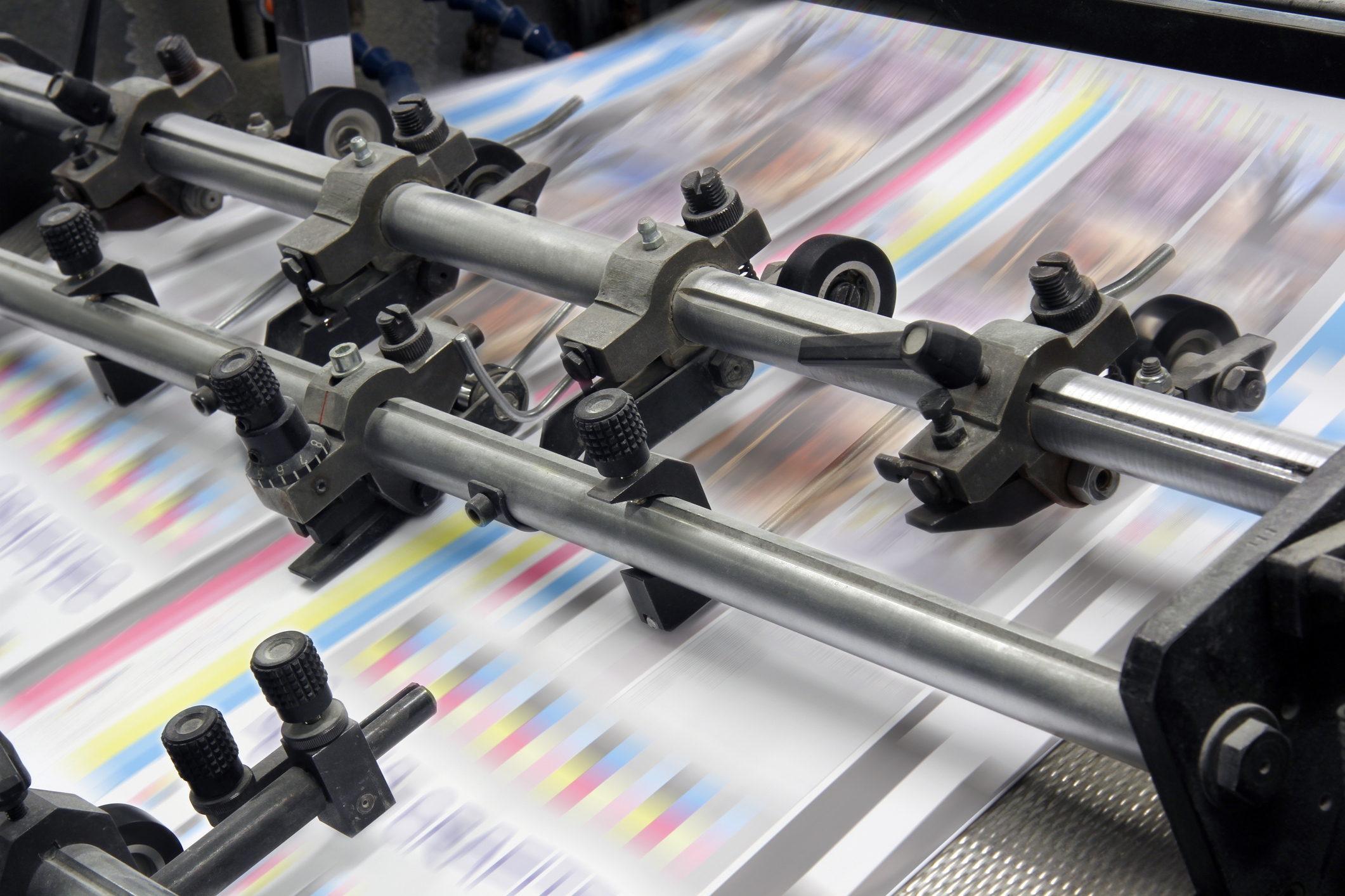
Photos
Photographs and other "raster" images should be 300ppi (pixels per inch) for best reproduction in print. They should also be submitted in their native colorspace, with their native color profile tagged.
This means that if a photo was taken on a professional camera, using the Adobe RGB color profile, that is what should be submitted to your printer.
Spot Colors
Spot colors (such as PANTONE colors) should be used when designing for print whenever a critical color match is needed. Even when a job will be printing with CMYK or an expanded color gamut ink set, spot colors should still be used. Many printers (like Casey Printing) will convert spot colors to their destination color set in prepress. Special tools are used to perform this conversion that will produce the closest possible match to their intended color, taking into account the exact substrate and color set that will be used for production.
Vector Art
Vector artwork, such as Adobe Illustrator files, and the copy in InDesign documents should have color be defined as CMYK or PANTONE colors. Submitting these as RGB colors will work fine, but may produce different results than intended.
Bleeds & Safety
Jobs should be designed with 1/8" bleeds and 1/8" safety. If a job will be die cut, this can be reduced to 1/16" bleeds and 1/16" safety.
Fonts
Although not strictly necessary, it is a best practice to outline fonts before sending a PDF to a printer. If you are sending native files (such as an Adobe InDesign document) then files should be included.
Submission
In most cases, it is best to send your files to a printer as a PDF file. We recommend using the PDF-X/4 Standard. Remember to check the box that maintains your bleeds. No other "printers' marks" are needed - they actually have to be removed.
On the rare occasion that native files are needed, your printer will typically let you know before submitting. In this case, all supporting files (images, graphics and fonts) should be included.