

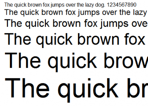

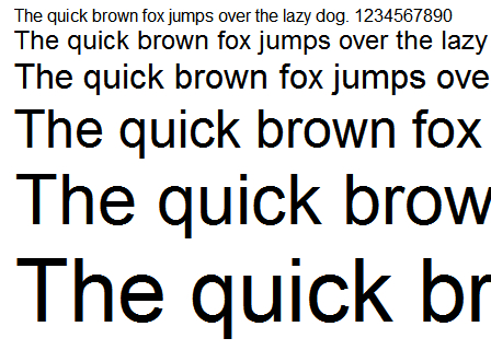
Nearly ubiquitous since the early 80's, Arial's pervasiveness is the stuff of font legend. A neutral sans serif typeface originally based on Monotype Grotesque, Arial has firmly established itself as the de-facto stand in for Helvetica, much to the chagrin of the design community at large.
Designed in 1982 for Monotype Typography by a team of ten led by Robin Nicholas and Patricia Saunders, Arial was originally designed for the IBM 3800-3 laserxerographic printer. Arial has also shipped with every version of Microsoft Windows since version 3.1 (released in 1992). Apple, who opted to use Helvetica for it's default font, did not ship with Arial until OS X (released in 2002).
Designed to be a more 'contemporary' font than it's industrial predecessors, Arial was intended for the digital age. This is evidenced by it's rounder, fuller treatment of curves and the diagonal cuts of the terminal strokes. Arial nearly matches Linotype's Helvetica in proportion and weight, but sports a more Humanist appearance.
The Controversy

Many designers and type enthusiasts have a generally low opinion of Arial, claiming it bears too close a resemblance to Helvetica while being inferior in design. There's also controversy surrounding Microsoft's decision to make a Helvetica "knock-off" typeface to avoid paying royalty fees to Linotype. Although officially based on Monotype Grotesque, Arial is nearly identical to Helvetica in it's glyph widths, proportion and weights. There was much disdain for the new font in the design and type community, including typographer Mark Simonson, who was quoted as saying that using Arial "was like asking for Jimmy Stewart and getting Rich Little."
When to use Arial
Arial is an appropriate font to use in any application where design sensibilities are not of major import. Examples of this might be Power Point presentations, emails, homework, office memos, faxes, video, online copy or other basic documents.
When not to use Arial
Although Arial does feature a postscript version (Arial MT) and is a printable font, I would not recommend it for print design work (most designers would agree with me here). Instead, consider using Helvetica or Myriad Pro. These fonts tend to look much nicer printed and seem to boast better glyphs, more flexible variants, spacing and metrics. I would also steer away from using Arial in logo work. Not only are there several typefaces that would do a much better job, but you'll also risk upsetting your client when they learn you've used a free generic font to create their corporate identity.
As always, use your best judgement when deciding whether or not this typeface is appropriate for your design’s message and audience.