LEARNING CENTER

Articles, Training, Videos, Tips, eBooks, and More!

Subscribe ›
Topics: Typography

Typography Shop Talk: Web Design vs. Graphic Design

Brian Coale

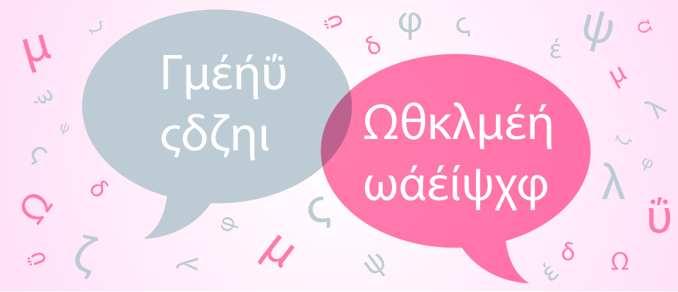
Even if you've never heard of the term “Shop Talk,” chances are still very good that you've heard shop talk, or may have even participated in it yourself. In a nutshell, shop talk is the jargon specific to an occupation or special interest. One common example of shop talk you may have participated in is sports jargon. Inning, Safety, Punt, Quarterback, Strike, Goal, Ball, Foul, Out, Steal, Error and so on. Photographers may refer to F-stops, Focal Lengths, ISO, Shutter Speeds & Megapixels, while designers may talk about Color Spaces, Color Theory, Wireframes, Mood Boards, Levels, Pixel Depth, Strokes and Fills. Whatever your profession or interest, there's likely some Shop Talk associated with it.

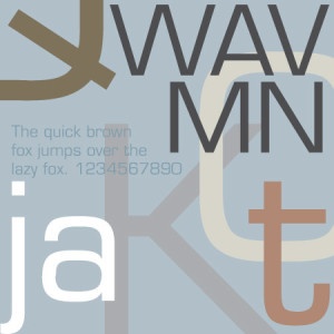
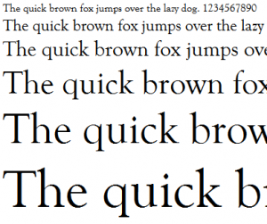
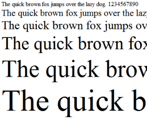
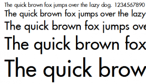
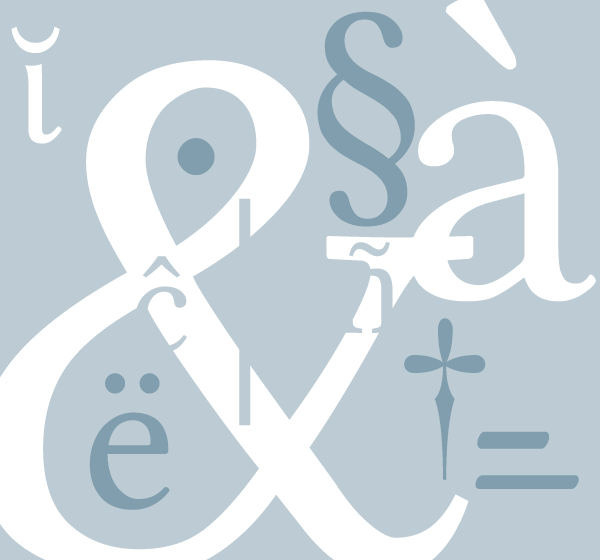
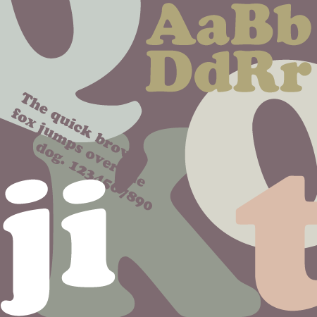
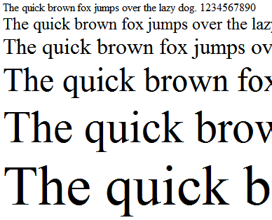
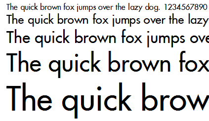
Today we're going to focus on Typography, and the curious case of two different trades that use their own very different Shop Talk to describe very similar concepts: Web Designers and Graphic Designers.

Topics: Design Typography Print

Points vs Picas - Understanding Common Print Measurements

Brian Coale

Picas, pronounced PIE - KAH, are a typographic measuring system developed in 1785 by François-Ambroise “L'éclat” Didot that replaced the traditional cicéro measurement system. Comprised of 12 “Points,” Picas are still the standard measuring system for typography today, but many designers still prefer to use more widely accepted measurements such as inches and millimeters. So today we'll try to answer the question: What are Points and Picas - and what's the difference?

Topics: Typography

What's That Thingy Called? The Real Names of Common Special Characters

Brian Coale

If you're in just about any walk of the communication industry, be it Publishing, Marketing, Graphic Design, Web Design, Journalism, blogging or you name it, chances are you've used special characters — and lots of them (see what I did there?).

Special Characters are a category of typographical elements that include ligatures, diacritics, glyphs and punctuation marks, and, although we use them all the time, you would be surprised how few people in our industry know the proper typography vernacular. So if you're an old typography pro, take a moment to brush up. If you're new to typography, this is an excellent opportunity to learn more, so read on!

Topics: Typography

Linux Libertine, the Open Alternative

Brian Coale

Designed as an open source alternative to commonly used proprietary fonts such as Times Roman, Linux Libertine is one of the few completely free and truly open-sourced font families in existence, and also one of the most popular. From start to finish, Linux Libertine is the apex of open sourced: from its creation in Font Forge (the free font editor) to it's GNU General Public and SIL Open Font Licenses.

Designed by the Libertine Open Fonts Project and released in July of 2012, both Linux Libertine and Linux Biolinum were bundled with LibreOffice, the default office suite in many Linux Distributions such as Ubuntu, Fedora, OpenSUSE and Linux Mint. Despite being a freely available and relatively new typeface, Linux Libertine boasts an impressive 2,000+ glyphs encompassing the Greek, Cryllic and Hebrew Alphabets and several ligatures and special characters.

Topics: Typography

Cooper Black, the far-sighted font for near-sighted readers.

Brian Coale

Widely used in the 1920's to 1930's, and considered somewhat iconic of the 1970's in modern times, Cooper Black is an old style serif font based upon Cooper Old Style.

Designed by Oswald Bruce Cooper in 1921, Cooper Black was released by the Barnhart Brothers & Spindler type foundry in 1922. Advertised as being "for far-sighted printers with near-sighted customers," Cooper Black was dubbed "The Black Menace" by it's critics. Cooper Black inspired many imitations, but none enjoyed the popularity of the original.

Topics: Typography

Garamond, the Eco-Friendly Font

Brian Coale

A highly popular and much-emulated font, Garamond represents a group of old-style serif typefaces named after Claude Garamond.

Claude Garamond was a punchcutter who cut types for the Parisian printer Robert Estienne in the early sixteenth century. He based his romans on those designed by Francesco Griffo, who cut type for the Venetian printer Aldus Manutius in 1495. After Claude Garamond died in 1561, his punches were sold to the printing office of Christoph Plantin in Antwerp, where they were used for several decades. A complete set of the original Garamond dies and matrices is still on display at the Plantin-Moretus museum even today.

Topics: Typography

Eurostile, the Space Age font

Brian Coale

A child of the Space Race and a perfect representation of it's time, Eurostile is an acutely distinctive font with a characteristically chic and sophisticated appearance.

Designed in 1962 by Aldo Novarese for the popular Nebiolo type foundry in Italy, Eurostile was based on Novarese's earlier work Microgamma. While Microgamma featured only capital letters, Eurostile included upper and lower case letters, bold condensed variants, and the ultra-narrow Eurostile Compact variant. In all, the original Eurostile family contained seven fonts.

Topics: Typography

Goudy Old Style, the Graceful Typeface

Brian Coale

One typeface that has greatly inspired my love for typography over the years is Goudy Old Style. Elegant and stately, Goudy Old Style is a fine choice for any creative that that requires an ambiance of beauty and nobility.

Goudy Old Style was created by Frederic W. Goudy in 1915 on behalf of the American Type Founders, a business trust created in 1892 by the merger of 23 type foundries, representing about 85% of all type manufactured in the United States.

Topics: Typography

Times New Roman, the newspaper font

Brian Coale

Few fonts are as ubiquitous and widely accepted as Times New Roman. So ubiquitous in fact, that it is not unusual to see Times offered up as the default serif typeface for many word processors and other programs that handle type.

Commissioned by the British newspaper The Times in 1931 after designer and typographer Stanley Morison criticized the publication for being "typographically antiquated," Times New Roman was drawn by Victor Lardent under Morison's supervision for the Monotype Corporation. It was first used in the October 3, 1932 edition of The Times and released for commercial sale in 1933. The Times would use this typeface for the next forty years.

Topics: Typography

Futura, the forward thinking font

Brian Coale

You know a typeface is special when it has been around as long as Futura has, and is still considered modern and "forward thinking." Although Futura is somewhat retro-futuristic these days, kind of like Lost in Space or Star Trek the Original Series, it still somehow manages to conjure feelings of progress and forward movement — a perfect fit for the Industrial Age.