


One of my favorite fonts, and a beautiful work that has stood the test of time.
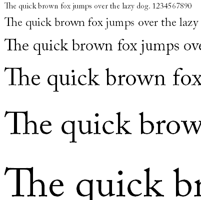
Cited as the first original typeface of English origin, Caslon is a serif typeface that was designed by William Caslon I (1692–1766) in 1722. Sharing the irregularity characteristics of Dutch Baroque types, Caslon is characterized by short ascenders and descenders, bracketed serifs, moderately high contrast, robust texture, and moderate modulation of stroke.
Type historians Stanley Morison and Alfred F. Johnson, a scientist who worked at the British Museum, point out the close similarity of Caslon's design to the Dutch Fell types cut by Voskens and other type cut by the Dutchman Van Dyck.
One of the earliest mentions of Caslon as a punch-cutter and typefounder appears in John Nicols, Biographical and Literary Anecdotes of William Bowyer 1782, where he writes: "he (Caslon) cut the beautiful fount of English."
Nicols describes this character as far superior over contemporary Dutch founts used in English books at this period.
Revivals
With the rise of hot metal typesetting in the late 19th century, existing foundry metal typefaces such as Caslon's had to be adapted to specific typesetting technology. This was true again with phototypesetting in the 60's and 70's, and then again with digital typesetting from the mid-80's to today. As a result, there are many typefaces called "Caslon" which reproduce the original designs with varying degrees of faithfulness.
When to use Caslon
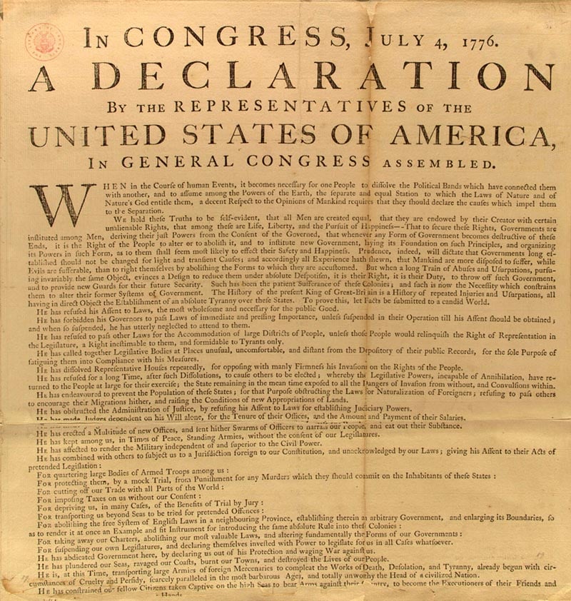
Soon after their design, Caslon's types were immediately successful and used in many historic documents, including printed copies of the U.S. Declaration of Independence. It has also been used in successful modern publications such as The New Yorker and Audubon.
Superior legibility, beautiful curves and lines with varied weight and tension are all trademarks of any Caslon typeface. As such, Caslon lends itself very well to books or official documents that require large amounts of reading.
In larger sizes, Caslon can lend a touch of "class" as a headline or design element.
When not to use Caslon
Caslon has a wide variety of uses and is rarely inappropriate. In fact, for many years a common rule of thumb among printers and typesetters was "When in doubt, use Caslon."
However, is does have a very classic "old world" look to it, and therefor does not always translate well into frivolous, humorous, modern or futuristic designs. Also, being a serif font, it loses legibility considerably on pixel-based reading surfaces such as computer monitors, smart phones and tablets. Caslon fares somewhat better on E-Ink screens such as Amazon's Kindle, but typically should be avoided for most digital applications.
In summary, Caslon remains one of my "go-to" typefaces, and I have used it in too many designs to recall. If you've never used it before, I would recommend you give it a try. It really is an exquisite typeface.
As always, use your best judgement when deciding whether or not this typeface is appropriate for your design's message and audience.