


Widely used in the 1920's to 1930's, and considered somewhat iconic of the 1970's in modern times, Cooper Black is an old style serif font based upon Cooper Old Style.
Designed by Oswald Bruce Cooper in 1921, Cooper Black was released by the Barnhart Brothers & Spindler type foundry in 1922. Advertised as being "for far-sighted printers with near-sighted customers," Cooper Black was dubbed "The Black Menace" by it's critics. Cooper Black inspired many imitations, but none enjoyed the popularity of the original.
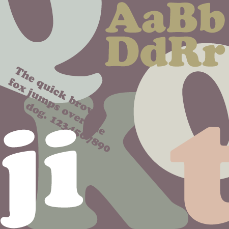
Cooper Black is characterized by it exaggerated heavy weight, blunt and rounded serifs and forms, small counters, the backwards tilt of the counters on the Q's and O's, and the elliptical dots on the j and i.
Throughout the years, variants of Cooper Black have included Cooper Hilite, Cooper Black Italic and Cooper Black Condensed.
When to use Cooper Black
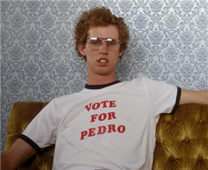
Cooper Black has been used extensively to bring a "retro 70's" appearance to a design, and is also useful for flyers or signage that need to be legible from a distance. It has been used in several TV shows, such as Dad's Army, The Bob Newhart Show, Cheers, Everybody Hates Chris, Louie and Derik, as well as in popular music titles such as The Beach Boys album Pet Sounds, Mother of Invention's Freak Out!, The Doors album L.A. Woman, Marina Diamond's Electra Heart and more. Cooper Black has also been used as the logo for easyJet, Tootsie Roll and for many novelty t-shirts, such as Napoleon Dynamite's Vote for Pedro t-shirts.
When not to use Cooper Black
Although Cooper Black has great legibility and popularity, you may find that it is not appropriate for most creatives due to it's retro appearance and lack of elegance. Cooper Black's exaggerated font weights almost give it the appearance of "shouting" at the reader, which makes it a poor choice for body type or long form reading.
In summary, use your best judgement when deciding whether or not Cooper Black is an appropriate typeface for your design’s message and audience.