


A child of the Space Race and a perfect representation of it's time, Eurostile is an acutely distinctive font with a characteristically chic and sophisticated appearance.
Designed in 1962 by Aldo Novarese for the popular Nebiolo type foundry in Italy, Eurostile was based on Novarese's earlier work Microgamma. While Microgamma featured only capital letters, Eurostile included upper and lower case letters, bold condensed variants, and the ultra-narrow Eurostile Compact variant. In all, the original Eurostile family contained seven fonts.
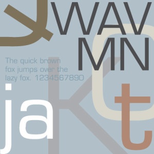
Eurostile is a geometric sans-serif characterized by it's squarish shapes with rounded corners, width-oriented proportions, a lower-case t with a long right crossbar and 180° curve on the tail, the flat apexes on the capital W, A, M, N and V, and the tail on the Q that is longer on the inside than it is on the outside. The typeface captures the spirit of the 50's and 60's, yet maintains a somewhat futuristic appeal.
When to use Eurostile
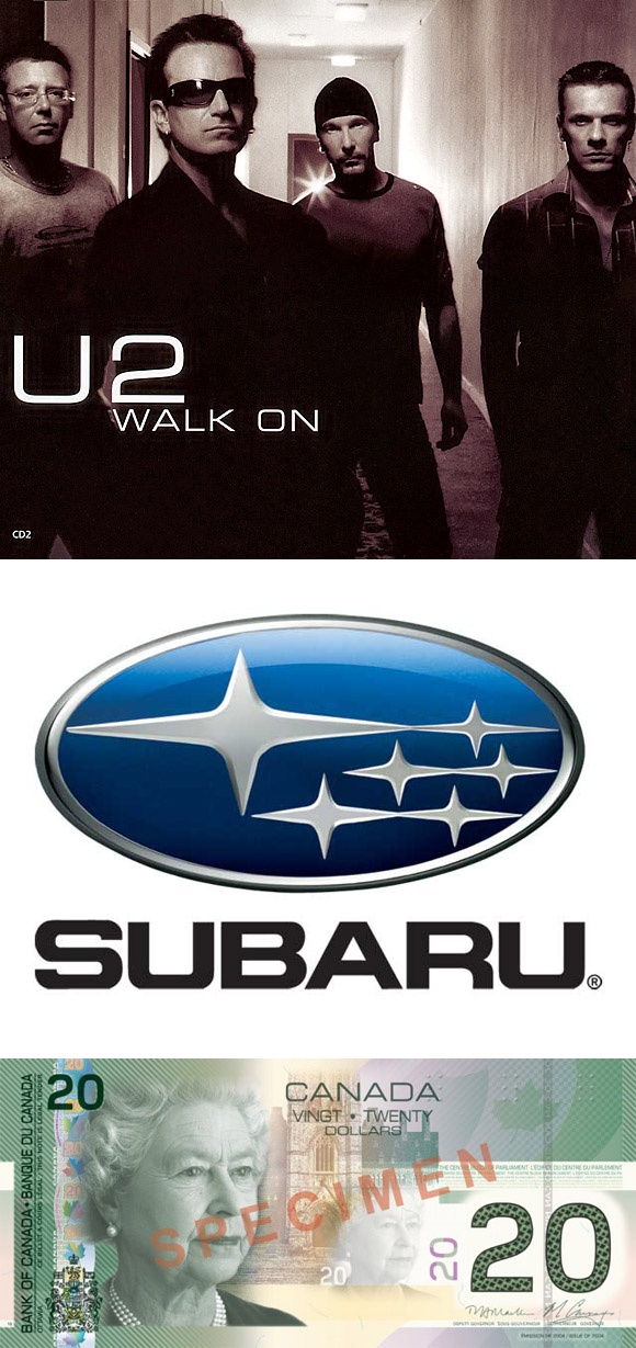
Eurostile has a distinctive quality that makes it an excellent display font, yet is is utilitarian enough for everyday use as well. This has made Eurostile a popular choice for a wide variety of applications. It has been used extensively in the music industry, appearing on the album covers of artist such as U2, The Supernaturals, Ash, Pendulum, Westlife, Eminem and Marilyn Manson in addition to several dance compilations from Warner. It has also been used on several TV series, video games, cars, logos and even currency.
When not to use Eurostile
Although Eurostile's stylish elegance make it good choice for many applications, it is not right typeface for every application. You may even find that it is just distinctive enough to not be the right typeface for most applications. Invitations, for instance, might be a good example of where Eurostile might be a poor choice. Despite it's adequate readability, I couldn't imagine reading a 400+ page book set in 9pt Eurostile.
As always, just use your best judgement when deciding whether or not Eurostile is an appropriate typeface for your design’s message and audience.