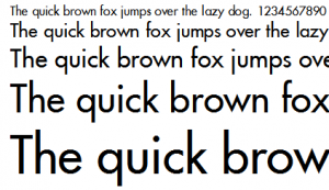
You know a typeface is special when it has been around as long as Futura has, and is still considered modern and "forward thinking." Although Futura is somewhat retro-futuristic these days, kind of like Lost in Space or Star Trek the Original Series, it still somehow manages to conjure feelings of progress and forward movement — a perfect fit for the Industrial Age.
Futura was designed in 1927 by Paul Renner, a typeface designer born in Wernigerode, Germany who was said to have disliked advents of the modern culture such as Cinema, Dancing and Jazz. Nonetheless, he was enamored with modernist movement's functionalism, making him something of a bridge between traditional and modern philosophies. This becomes apparent in Futura, which draws from classical Roman forms and proportions while defying historical methods in favor of a Geometrical type design that had more to do with Modernist philosophical agenda than typographical theory.
Futura is considered a Geometric Sans Serif that shared many of the idioms of the Bauhaus design style that was popular in the early 20's and 30's. Futura was released in 1936 by the Bauer Type Foundry to compete with the Erbar typeface, which was the first of the Geometric Sans Serif typefaces.
The typeface is characterized by simple geometric shapes, such as circles, squares and triangles, and low-contrast, even strokes. Minimalist in nature, the font is devoid of decorative elements and embellishments, and features proportions similar to classical Roman capitals in the upper-case characters and firm, clean forms.
When to use Futura
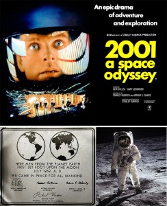
Although Futura has a somewhat dated, almost Art Deco appearance, it still somehow inspires thoughts of progress and the future. It is simultaneously classic and modern, which makes it an appropriate font for many different applications. This retro-futuristic appeal can be noted by its use in 2001: A Space Odyssey and perhaps most famously on the Apollo 11 plaque left on the moon. It is classy enough to be featured on the Louis Vuitton storefront, yet solid enough to be used for logo work (Dominos Pizza, Costco, Absolut Vodka, Union Pacific and Best Buy to name a few).
When not to use Futura
Although Futura is a remarkably legible font given it's disregard for classical typographical theory, it's even weights and lack of visual hints make it a poor choice for large bodies of copy. Too much Futura at 12pt or lower will inevitably cause eye fatigue and lead to reader indifference. In addition, Futura's geometric forms and sharp edges can make it a poor choice for design applications that require a softer, more rounded appearance.
Just remember use your best judgement when deciding whether or not this typeface is appropriate for your design’s message and audience.


