

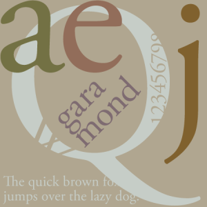


A highly popular and much-emulated font, Garamond represents a group of old-style serif typefaces named after Claude Garamond.
Claude Garamond was a punchcutter who cut types for the Parisian printer Robert Estienne in the early sixteenth century. He based his romans on those designed by Francesco Griffo, who cut type for the Venetian printer Aldus Manutius in 1495. After Claude Garamond died in 1561, his punches were sold to the printing office of Christoph Plantin in Antwerp, where they were used for several decades. A complete set of the original Garamond dies and matrices is still on display at the Plantin-Moretus museum even today.
60 years after Garamond's death, a French printer by the name Jean Jannon published a set of typefaces similar to Garamond. Though his designs were slightly more irregular, they would later be mistakenly attributed to Garamond by typography expert Beatrice Warde. This would result any many Jannon-derived Garamond typefaces (Monotype Garamond, Simoncini Garamond, LTC Garamont, Linotype Garamond 3 and ITC Garamond). While Slimbach and others would make revival typefaces more true to Garamond's designs (Adobe Garamond, Garamond Premier, Ludlow Garamond, Stempel Garamond and URW++ Garamond No 8).
Garamond is characterized by it's smaller-than-average apertures that are closed off early on the stem, low line contrast, slightly cupped bases on the serifs, downward-sloping upper serifs, calligraphic terminals, serifs that are both heavily bracketed and rounded on the edges, pronounced diagonal stress, higher x-height and large difference between cap and ascender. Garamond is considered one of the most legible and readable fonts in print, and also one of the most eco-friendly major fonts due to it's lower ink usage.
When to use Garamond
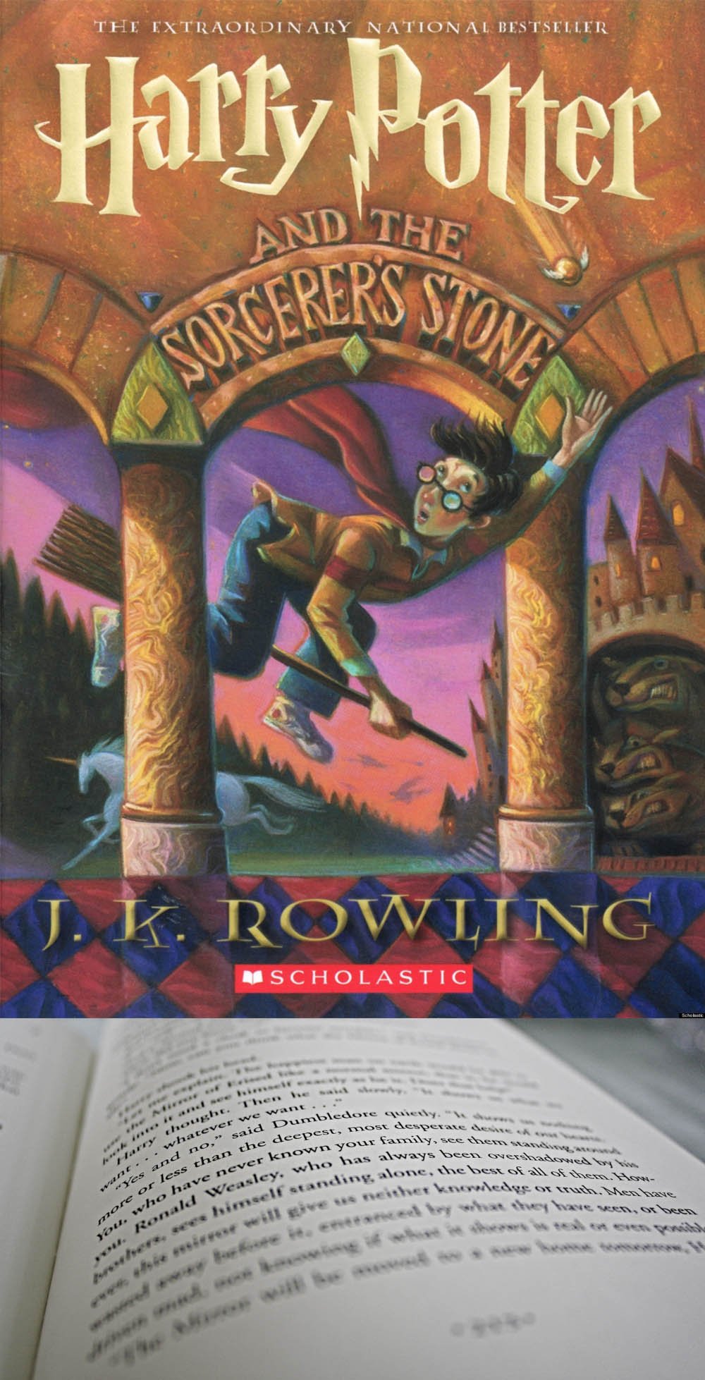
Because of it's superior legibility, economic ink usage and classic forms, Garamond is a favorite for books, manuals or any printed material that features large bodies of small type. It has been used in all American editions of J. K. Rowling’s Harry Potter books, the Hunger Games trilogy and the Shiver Trilogy. It has also been used in the large Dr. Suess picture books, The Guardian newspaper's masthead, Nvidia's scientific journals and many O’Reilly Media books. Whenever readability is the primary concern, Garamond is a fine choice.
When not to use Garamond
![]()
Like many old-style serif typefaces, Garamond does not hold up well on computer screens and mobile devices (with the possible exception of e-ink devices like Kindle), making it a poor choice for the screen in smaller font sizes. This drawback is exacerbated by Garamond's low line contrast. Basically, the very same attributes that make it such a great print font effectively thwart it's usefulness as a screen font.
In summary, use your best judgement when deciding whether or not Garamond is an appropriate typeface for your design’s medium, message and audience.