


The workhorse Sans Serif of the 60's and 70's, and still widely used today, Helvetica is the typeface to which all other Sans Serif typefaces are compared (a fact that has caused both praise and consternation in the design community).
First developed in 1957 by Max Miedinger and Eduard Hoffmann at the Haas type foundry (Haas’sche Schriftgiesserei), Helvetica was designed to be an everyday typeface with exceptional legibility that could be used for a great variety of applications. Helvetica was based largely on the Akzidenz-Grotesk typeface, and is technically considered to be in the "sans serif Grotesque" family of typefaces, along with Haettenschweiler, Folio, Franklin Gothic, Eurostile, Geneva and many others.
In 1960 the marketing director at Stempel, the type foundry that controlled Haas, changed the name of the typeface to Helvetica (Latin for Swiss) to increase it's international appeal.
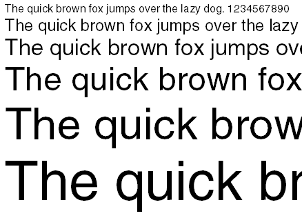
The Helvetica typeface is characterized by it's tall x-height, square s, two-storied a, narrow t and f, rounded square tail on the upper-case R, and bracketed top serif of the numeral 1 character. It also features consistently horizontal and vertical terminations (never diagonal), carefully crafted negative space, monotone stroke weights and remarkable legibility when animated.
When to use Helvetica
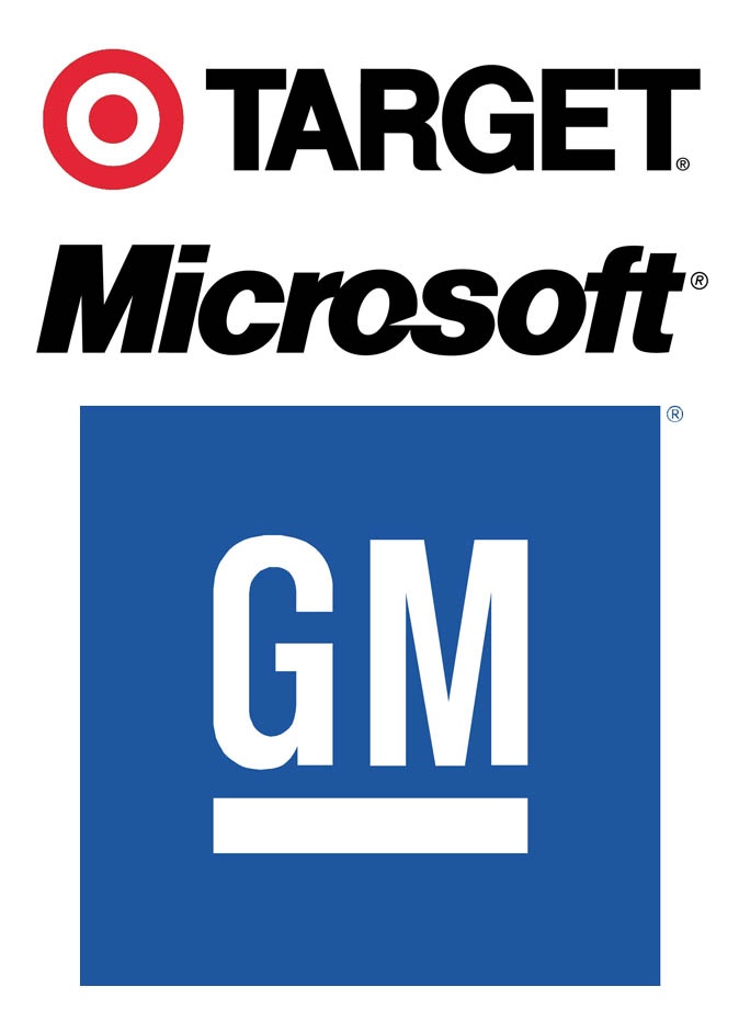
Because of Helvetica's neutrality, it is appropriate for a large array of design applications, not the least of which is logos. It may surprise you to know that Helvetica is used in many of the world's most popular and recognizable logos: American Airlines, Staples, Jeep, Nestle, Toyota, Post-it, BMW, Sears, Target, Microsoft, Panasonic, Tupperware, Scotch, 3M, Caterpillar, Evian, Skype, Energizer, CVS, BASF, Oral-B, Harley Davidson, GM, Motorola, Mattel and JCPenny just to name a few.
Helvetica is also an excellent font to use in videos, thanks to it's superior legibility while animated. It fares better than other sans serif types at smaller point sizes when printed as well.
When not to use Helvetica
Despite Helvetica's excellent craftsmanship and advantages, you may often find that it is not the right font for the job. One possible reason might include the venerable nature of the font. Helvetica is over 50 years of age, so in many design circles is not considered a modern font. You may also find many situations where Helvetica's neutrality is undesirable. Can you imagine a funeral program or wedding invitation designed in Helvetica? You might also find that Helvetica falls short in designs that require a more statuesque appearance, such as high-end publications, official documents or news publications that typically require a look that commands respect and trust. Helvetica can often appear whimsical in these aforementioned publications.
By the way, if you've never seen Helvetica the movie, it's worth a look. You can check out the trailer here:
Just remember use your best judgement when deciding whether or not this typeface is appropriate for your design’s message and audience.