


Few fonts are as ubiquitous and widely accepted as Times New Roman. So ubiquitous in fact, that it is not unusual to see Times offered up as the default serif typeface for many word processors and other programs that handle type.
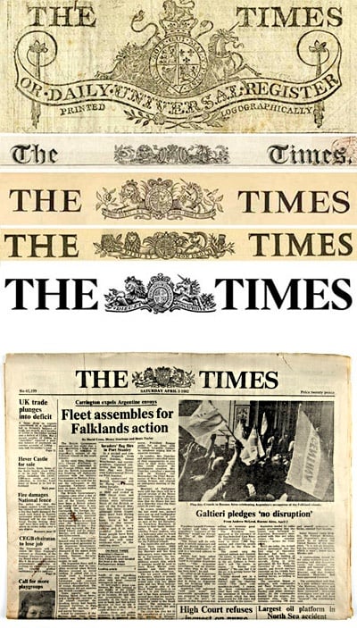
Commissioned by the British newspaper The Times in 1931 after designer and typographer Stanley Morison criticized the publication for being "typographically antiquated," Times New Roman was drawn by Victor Lardent under Morison's supervision for the Monotype Corporation. It was first used in the October 3, 1932 edition of The Times and released for commercial sale in 1933. The Times would use this typeface for the next forty years.
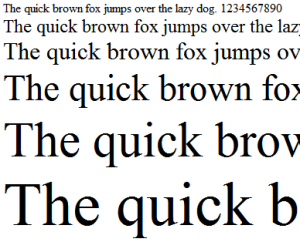
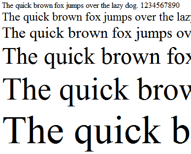
Times New Roman is a serif typeface built specifically for newspapers. As a result, one of the noticeable differences between Times New Roman and other typical serif fonts is it's narrow characters and economic spacing. This enables typesetters to fit more text per line, making better use of the 'real estate' so to speak. Times New Roman is characterized by it's thin, sharp serifs with short brackets, lobes & ears on the g, noticeable terminals on the lower-case(a, r, j, f and y for example), tall numerals, crisp resolute characters and prominent diagonal stress. Overall, the typeface exhibits a somewhat subdued elegance.
When to use Times New Roman
Available in every copy of Windows since version 3.1 and in OS X since version 10.5 (previous versions of OS X used Linotype's Times Roman, an almost identical font in name and appearance) and used as the default font in many applications (particularly word processors and browsers), Times New Roman is widely available and is often used as the de-facto font in everyday documents. It's legibility and narrow spacing make it an ideal font for periodicals, text books, novels or other applications where large bodies of printed type are required.
When not to use Times New Roman
From a design viewpoint, Times New Roman is unremarkable. It's very pervasiveness makes it commonplace, and it's cut is designed more for function than form. It has little inherent emotional value or flair, and is designed to be unbiased and neutral. These attributes make it an unattractive choice for any creative that uses typography as a principle design element. For these reasons, I would recommend avoiding Times New Roman for most applications. There are many more interesting alternatives that can lend their beauty and craftsmanship to your design work.
Oh, and before I go, have a look at this nice short about Times New Roman from the Unquiet Film Series:
Basically, just use your best judgement when deciding whether or not Times New Roman is appropriate for your design’s message and audience.