


I still remember the first time I sent a file to a commercial printer. I was a fledgling designer building my first magazine layout for a professional architecture magazine. I toiled and sweated over that issue, and when I thought it was ready, I couldn't be more proud of my creation. This was the masterpiece that was to kick my career into high gear. Then I sent the files to the printer, and what happened next made me feel like a 1st-year rookie (which I was): The printer rejected the files. Hairline strokes, embedded images, inconsistent margins, and missing fonts were just a few of the culprits, and I really can't remember all of the rest. The bottom line: Creating flawless press files for your printer can be a technically daunting and difficult task.
Luckily, the software used by both printers and designers has improved greatly in the past decade, and it is much more forgiving. Nonetheless, there are still steps you can take to minimize costly and time-wasting headaches for both you and your printer.
1. Avoid the Color ‘Registration’
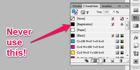
I know this seems like a big ‘duh’ to most of you, but you would be surprised how often this happens. After all, in InDesign, Registration looks just like the color black. So for those of you who don't know, here's the deal. Registration is a special color designed for registration marks, hence the name. Since registration marks must appear on all plates, the registration color also appears on all plates. Therefor, in a standard process color scenario, this would be 100% Black, 100% Cyan, 100% Yellow and 100% Magenta. This is not a suitable replacement for Black (100% B, 0% C, 0% Y, 0% M) so please, never, ever use Registration. Ever.
2. Avoid Spot Colors if Possible
Typically, the only scenario that necessitates the use of a Spot color is when a (usually) large organization is following a branding guide that requires the use of a specific company color, and is willing to invest the extra cost of adding additional plates. In normal 4-plate process jobs spot colors are converted to the CMYK color space, resulting in unpredictable color shifts in the finished job. Spot colors can also be problematical when used with effects or gradients. Bottom line: unless you are mandated by the company or branding guideline to use spot colors and have considerable experience using them in a professional printing environment, avoid spot colors. Spot colors can be identified by their naming conventions, for example: APNA, DIC, FOCALTONE, HKS, PANTONE (PMS), TOYO, and TRUMATCH.
3. Avoid Excessive Effects
I know, we all love bevel, emboss, and drop shadows, but the more effects you use the more difficult the file becomes to process, and the greater the risk your press files will fail in the rip and return unexpected results. This goes for transparency as well (especially transparencies layered on top of transparencies). If you need a lighter color, adjust the ink levels in the color slider, that's what they're for. Only use transparencies and other effects when absolutely necessary.
4. Use Margins and Bleeds properly
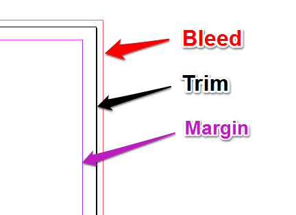
We've all seen the message in the rear-view mirror “Objects are closer than they appear.” With page layouts, the message would be “You're closer to the trim than you think.” It's always advisable to keep text and images at least a ¼" (1p6 picas or 6.35 mm) away from the trim. The easiest way to do this is to setup your margins when creating the document and staying inside the margin. In InDesign, the standard color key is purple for the margin, black for the trim, and red for the bleed.
5. Optimize and Save Your Export Settings
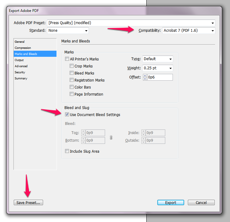
Finally, when your job is ready for prime time you'll need to export your file as a PDF. How you do this can make or break the suitability of your file for print. Luckily, InDesign has several built-in presets that get you most of the way there. Start by going to the File menu and navigating to File/Adobe PDF Presets/[Press Quality]...
When the dialog window pops up choose the location where you want to save your file. Now the fun begins. When the Export Adobe PDF dialog box pops up, the Adobe PDF Preset should say [Press Quality]. If it does not, press cancel and try again. The press quality preset will default to a Compatibility of Acrobat 5, but you can safely change this to Acrobat 7 (Acrobat 11 is the newest, and Acrobat 7 was released in 2009, so it should be safe). Next, navigate to the Marks and Bleeds tab and check the Use Document Bleed and Settings checkbox under the Bleed and Slug heading. Finally, click the Save Preset button to save these settings for later. Use a name that is easy for you to remember. Your custom setting will now appear in the Adobe PDF Presets menu in InDesign.
If this seems too technical, no worries: I've already done the hard work for you. Just download the following file:

Unzip the file. In InDesign, navigate to File/Adobe PDF Presets/Define and click on Load. Find the downloaded file, select it and click Open, then Done.
That's it! You should now have a new PDF preset called “Casey Printing Job Options” that includes all of the options we set in the previous instructions.