


Even if you've never heard of the term “Shop Talk,” chances are still very good that you've heard shop talk, or may have even participated in it yourself. In a nutshell, shop talk is the jargon specific to an occupation or special interest. One common example of shop talk you may have participated in is sports jargon. Inning, Safety, Punt, Quarterback, Strike, Goal, Ball, Foul, Out, Steal, Error and so on. Photographers may refer to F-stops, Focal Lengths, ISO, Shutter Speeds & Megapixels, while designers may talk about Color Spaces, Color Theory, Wireframes, Mood Boards, Levels, Pixel Depth, Strokes and Fills. Whatever your profession or interest, there's likely some Shop Talk associated with it.
Today we're going to focus on Typography, and the curious case of two different trades that use their own very different Shop Talk to describe very similar concepts: Web Designers and Graphic Designers.
Typeface vs Font Family
Most Graphic Designers would consider a typeface to be an entire family of fonts. Web Designers would consider “Font Family” to be a reference to a typeface's entire font family and, without any other font properties explicitly used, this would mean the typeface's “normal” or “regular” font. It's also important to note that while Graphic Designers choose a specific font for their design, Web Designers usually reference multiple font families. This is due to the fact the Web Designers can not know for certain what fonts are available on the computers that visit the websites they create. Sometimes, they may even just reference a font category, such as Sans Serif.
| Choosing a Font | Choosing a font family |
|---|---|
 |
Lorem ipsum dolor sit amet, consectetur adipiscing elit. Sed fermentum pretium nibh sodales congue. Cras et nunc placerat, semper augue ut, vehicula lorem. font-family: "Times New Roman", "Garamond", serif; |
Leading vs Line Height
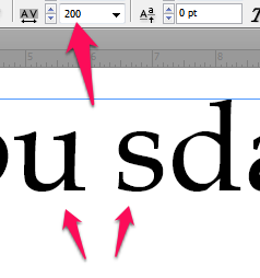
For Graphic Designers, leading is the term used to refer to the spacing between the baseline of two lines of type. The greater the leading, the farther apart two lines of type will be. For Web Designers, line height refers to the minimal height of line boxes within an element. The result is similar to leading, but the concept is completely different.
| Leading | Line Height |
|---|---|
 |
Lorem ipsum dolor sit amet, consectetur adipiscing elit. Sed fermentum pretium nibh sodales congue. Cras et nunc placerat, semper augue ut, vehicula lorem. line-height: 44px; |
Kerning vs Letter Spacing
In Graphic Design, kerning refers to the space between two characters, whereas in Web Design, letter spacing refers to the spacing behavior between all text characters. For a Graphic Designer, this behavior would be similar to tracking, which is itself an advent of digital publishing.
| Kerning | Letter Spacing |
|---|---|
 |
Lorem ipsum dolor sit amet, consectetur adipiscing elit. Sed fermentum pretium nibh sodales congue. Cras et nunc placerat, semper augue ut, vehicula lorem. letter-spacing: 0.3em; |
Point Size vs Font Size
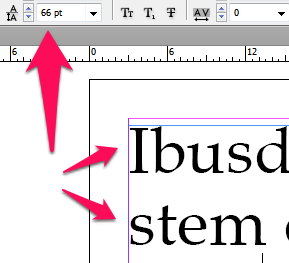
When Graphic Designers determine the size of a particular font, they almost always do it in points. Points are a subdivision of a Pica, which is the traditional unit of measure for typography. Web Designers, on the other hand, measure fonts in pixels (or sometimes em), which is the “standard” unit of measure for screen items.
| Points | Pixels |
|---|---|
 |
Lorem ipsum dolor sit amet, consectetur adipiscing elit. Sed fermentum pretium nibh sodales congue. Cras et nunc placerat, semper augue ut, vehicula lorem. font-size: 18px; |
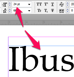
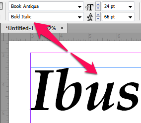
Font Style, Font Variant & Font Weight vs Font
When Web Designers reference a typeface using the font-family property, they are only referencing the family, not the font. In order for them to reference other fonts in the family, they need to make use of an array of properties. Namely: Font Style, Font Variant and Font Weight. Font Style facilitates italic or oblique, Font Weight determines the “boldness” of a font, while Font Variant enables Small Caps. Graphic Designers, on the other hand, must choose a font that has the properties they desire. For example: Garamond-Bold, Arial-Oblique, Goudy-Oldstyle-Italic, etc.
| Font | Weight, Style & Variant |
|---|---|
 |
Lorem ipsum dolor sit amet, consectetur adipiscing elit. Sed fermentum pretium nibh sodales congue. Cras et nunc placerat, semper augue ut, vehicula lorem. font-weight: 800; |
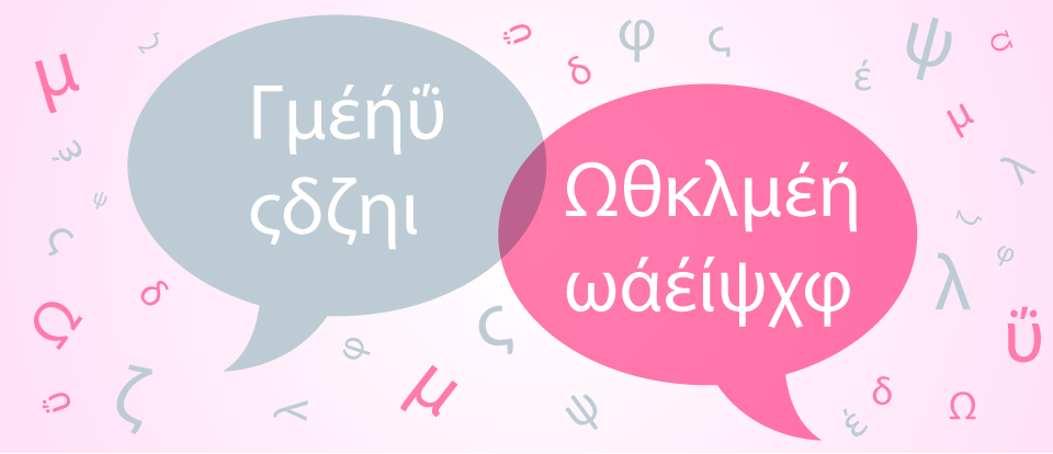
If all of this “sounds like Greek” to you, then you're not alone. Whenever I talk shop around friends and family, I invariably get shoulder shrugging and looks of perplexity. But hey, sometimes it's fun to have a little insider information, and now you do.