

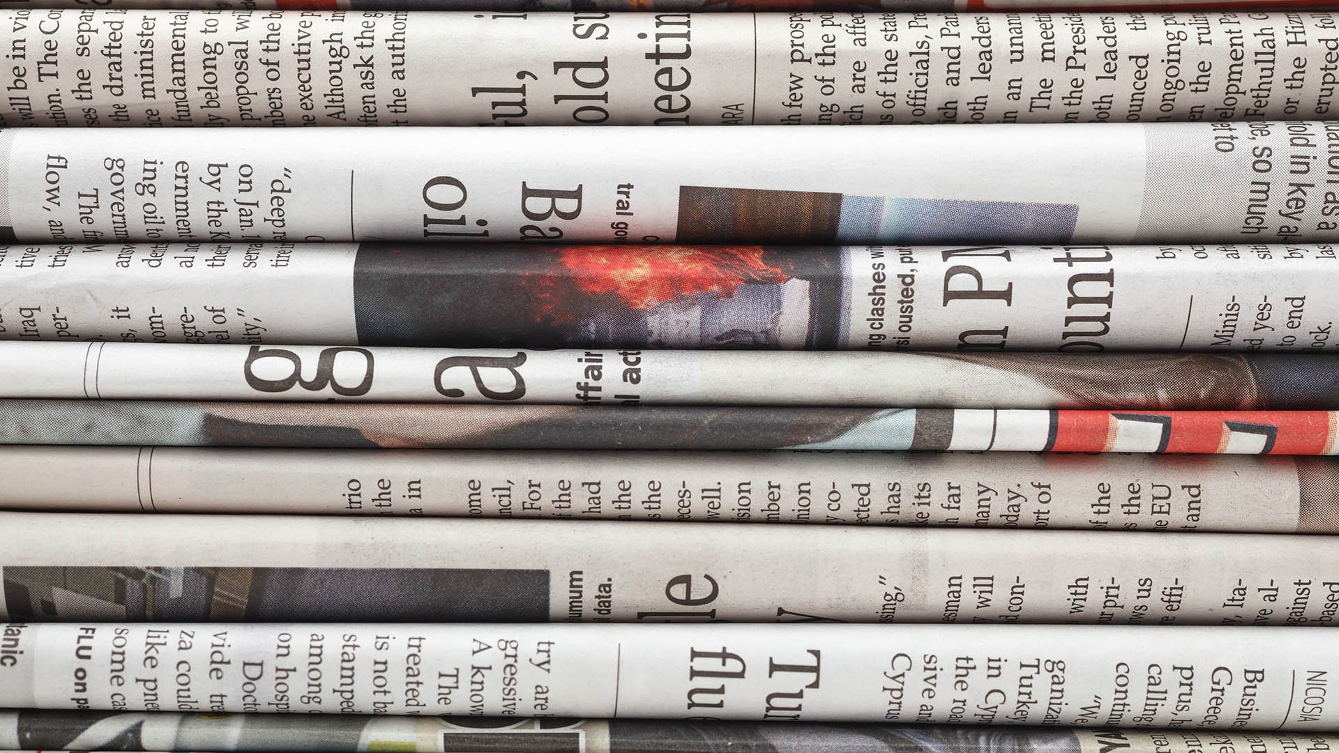

Newsprint is a highly-economical non-archival paper that best-known for its widespread use by news publishers, high-frequency magazines, classified publications, handbooks, phone books, textbooks, journals, guides, manuals and a variety of other common print products. Despite the recent decline in print publishers, newsprint is still widely used in many modern print applications.
In today's post, we'll be going over some basic tips for designing on newsprint, and why they are important for newspaper printing, or any other kind of print that uses newsprint paper.
1. Understand Color Gamut
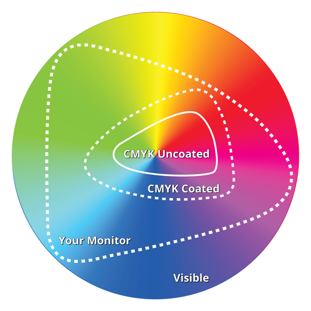
Color Gamut is the entire range of reproducible colors by any media or device. Paper, printers, presses and your monitor all have limits to the range of colors they can reproduce. This is that device or media's Color Gamut.
Newsprint is a highly-porous, uncoated paper consisting primarily of wood pulp. Because of this, the color gamut for newsprint is very narrow — a bit less than coated paper, and significantly less than your computer monitor. To get an idea of the difference, have a look at my (very non-scientific) graph above. Imagining that the circle is the entire spectrum of visible colors, the inner-most graph would be the gamut for newsprint. Now compare this to coated paper. Neither come close to the gamut of your monitor, which is important to keep in mind when designing for print using a computer screen.
2. Less Ink = Better Color
You will never be able to reproduce all the colors available on your screen on any paper, and even less colors will be available to you on newsprint. For this reason, it's important that you not try to saturate your colors too much. Instead, use color combinations that use no more than 2-3 of the four CMYK inks. There's a reason why yellow and red are such popular colors on newsprint: red is two inks (yellow & magenta), and yellow is one ink.
Watch your coverage. You should never go over 260% coverage if you can help it, and honestly I think even that is way too much (e.g. 100% Cyan + 100% Magenta + 60% Black = 260% coverage).
Less ink will result in better, brighter colors.
3. Compensate for Color Shift

One important thing to consider about newsprint is that it's typically not a very bright paper. In fact, it tends to be downright grayish-brown in color. Newsprint also has a much higher acidity than other papers. This is so it will break down quickly in land fills, and results in the paper 'yellowing' over time.
With the lack of bright whites, your images will have darker highlights and your colors may appear muddy or dull. You can compensate for this by adjusting the mid-tones of your images. Images that look slightly over-exposed or washed out will darken and look normal on newsprint, whereas saturated images or images with heavy shadows will look muddy and dark. You can compensate for dark or muddy colors by using less coverage (i.e. less ink).
You'll also want to watch for color corruption. Blues and yellows are very susceptible to this. For instance, you may have a swimming pool ad that, because of yellowing paper, turns all of the water green. No one wants to swim in those pools now!
4. If You Use Gradients, Be Bold
Gradients, if you use them, can be tricky on newsprint. Because of the narrow gamut and sometimes unpredictable color, they may not turn out the way you want them to. Usually your best bet is to avoid them altogether, but if you want to use them don't be shy. Favor dramatic color shifts over slight color shifts that may get lost or not reproduce faithfully.
Here's a few tips for gradients on newsprint:
- A 10% - 20% black gradient, if you notice it at all, may look like ink starvation or a mistake. Go bold, do a 25% - 75% gradient, or a 0% - 100%!
- Try to avoid gradients that shift from one color to another. Instead, consider shifting your gradient to white or black.
- If your going from a color to black, try adding black instead of shifting to it (e.g. red to red+black). This will prevent the color from shifting to gray in the middle, but mind your ink coverage if you do this!
- Getting good at gradients for newsprint takes a lot of practice. Use them sparingly.
5. Avoid Multi-Color Type & Knock-Outs

One of the most common mistakes designers make when designing for newsprint is using 4-color black. It is near impossible to register on a web press running newsprint. The result is blurry text, or text with 'ghosting' (when all the colors don't line up). Even if you do get it to register, you're likely to cause registration problems on the other side of the sheet. It's just bad design.
If you need to use color text, try limiting it to one or two colors and make the type bigger (the bigger the type, the easier it is to register).
Knock outs, or white type on a colored background, follow similar principles: limited colors, and bigger type is better. Avoid backgrounds that use too many colors or have too much coverage.
If you're designing in PhotoShop for newsprint, you may want to check out our blog post about Designing Type for Print in PhotoShop.
Is There Anything Else I Should Know?
Is there more to the story than what I covered in this brief article? Of course there is! But this is already a much larger article than I usually like to publish, so if you have any questions about designing for newsprint, feel free to sound off in the comments below.
You have a project you need some help with? We'd be happy to help you out! Just hit that "Talk to an Expert" button below and help is on its way.

Until next time, thanks for reading.