


Picas, pronounced PIE - KAH, are a typographic measuring system developed in 1785 by François-Ambroise “L'éclat” Didot that replaced the traditional cicéro measurement system. Comprised of 12 “Points,” Picas are still the standard measuring system for typography today, but many designers still prefer to use more widely accepted measurements such as inches and millimeters. So today we'll try to answer the question: What are Points and Picas - and what's the difference?
How big is a Pica?
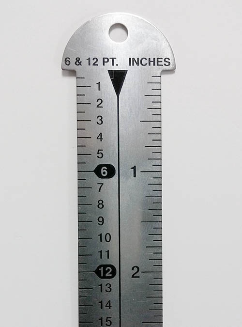
In Didot's time, a Pica was 1/72.27 ft, or about 0.166044 inches. After the advent of Postscript, Adobe rounded this out to 1/72 ft, or about 0.16667 inches. Picas are usually represented with points in this fashion: (picas)p(points), for example: 3p9 or 2p6. Sometimes you'll see them used in this fashion: 3P/6p, with the upper-case P denoting a Pica, and the lower-case p representing a point, although this usage is not as common. Here's a quick cheat-sheet for some common Pica conversions:
| Picas |
Points | Inches |
| 0p9 | 9 pt | 1/8 inch |
| 1p6 | 18 pt | 1/4 inch |
| 3p0 | 36 pt | 1/2 inch |
| 6p0 | 72 pt | 1 inch |
What are they used for?
Traditionally, Points and Picas were used to measure the height metal moveable type, leading, spacing a so forth. Being a very small and precise measurement made it well suited to this task, and it is used in much the same capacity today. When metal type was measured, the metal body the type was cast in was measured, not the type itself. This was carried forth into modern typography, where an invisible area surrounding the type known as an “Em Square” is what determines the point size of a font, not the font itself. Therefor, the cap height of a given font will typically be somewhat smaller than than the corresponding font's Point size.
You use them, too — whether you know it or not.
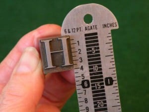
Have you ever used a 12 pt font? Well the pt indicates a point, which is a 1/12th fraction of a Pica. Points, and therefor Picas, are used just about anywhere a font is used that is intended for print. This is not only true for Postscript applications like Abobe Indesign, Adobe Illustrator & Quark XPress, but also for word processors like Microsoft Word, Microsoft Works, Word Perfect, Libre Office & Open Office as well. Additionally, if you've ever used the ruler pictured above, you've used Points and Picas.
So what's the point? (see what I did there?)
Unless you plan on designing everything in Picas from now on instead of Inches or Millimeters (I know many who do), you might just drop this into the “Good to Know” category, but understanding how Picas relate to typography and other more standard units of measurement can give you a real advantage when typesetting or managing layouts for print. It will also invariably give you a deeper understanding of how print layout programs like Adobe InDesign and Quark Xpress work, and why many other design tools work the way they do.
As always, thanks for reading, and if you have any questions about this topic, or you would like to get in touch with someone here at Casey, feel free to sound off in the comments below or to hit that "Talk to an Expert" button. Cheers!