


Mobile Friendly. Mobile Ready. Mobile Optimized. These words get thrown around a lot when talking about web design, with little or no explanation as to what the words really mean. That's because they are basically buzzwords designed to sell web design services. Google any of these terms and you'll find many explanations provided by articles and blogs like this one, but not many clear definitions. Web designers typically use words like these to describe a website that works better on mobile than it did before you procured their services.
Why go mobile?
Not only do search engines like Google reward sites that are mobile-friendly, but more people are using their mobile devices to shop, search and learn about you. If they have a poor experience when they visit your site, you might as well give them your top competitor's phone number and business card right now.
And the importance of mobile will only increase over time.
What's the difference between Mobile Freindly, Mobile Ready and Mobile Optimized?
Since the words are completely subjective, what's really important is how your web designer defines these terms. If you ask them, they should be able to give you their definition of a 'Mobile Friendly' site, unless they don't have one. Since there is no real standard definition, the meaning changes from firm to firm. So with that in mind, let me describe for you MY definition of these popular buzzwords.
Mobile Visible
OK, you got me. I just made that up, but for me it perfectly describes a non-mobile site in just two words. This is your typical static desktop website. It does not change with screen or window size and is very difficult to read and navigate on a smart phone or tablet. I bring this up because this is what some people mistake for mobile readiness. They think that because their website is "Visible" on a mobile device, that it is "Ready" for mobile delivery. Unfortunately, this is not the case, and any mobile traffic you get on a site like this will likely leave before the page even finishes loading.
Mobile Ready
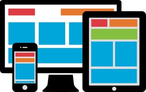
My definition of here is simple. It is a site that is ready to be viewed on a smart phone or tablet. The whole site fits on the screen, scrolling right to left is not required, and the text and pictures re-flow and re-size dynamically.
Mobile Friendly
Mobile Friendly has to do with the user experience of the site on a mobile device. The text is easy to read, the navigation is smooth and efficient, links are easy to click and not too close together.
Mobile Optimized
This is a more technical one. I define Mobile Optimized as being fine-tuned and streamlined to give the best possible performance on a mobile device. HTTP requests are minimized, Javascript and style sheet files are combined and compressed, aggressive caches are used, images are not just resized but replaced by smaller ones and the file size is kept to a minimum.
This is the hardest to achieve, but for the mobile user, likely the most rewarding. This can sometimes be acheived by using a flat responsive theme that makes very light use of images or complex layout structures.
How do I make my site mobile?
Converting an older static (Mobile Visible) website to one with a better mobile experience for smart phone and tablet users (Mobile Ready/Friendly/Optimized) will more than likely require rebuilding the site from scratch. Don't worry, that's not as bad as it sounds, and you'll be much better off in the long run. To begin, you can start with this checklist:
- Create a goal(s) for your website. What is it's purpose in your business? What do you want it to do for you? Why?
- Audit your current site to determine what information is still relevant/valuable and needs to be on the Mobile Ready site
- Create a list of new content and information that should be on your site (and why)
- Think about what defines your brand (logo, colors, mission, goals, etc.) so it can be represented on the new site
- Gather an "inspiration folder" of other websites, imagery or palettes from which your site will draw inspiration
- Determine a reasonable deadline goal (typically 3-6 months)
- Based on the above information, think about what you're willing to invest to launch your new website. Keep in mind that to capitilize on that investment, you need to make regular smaller investments going forward. Think of it as car maintenance. You can do it a little at a time and always have a car that performs well, or spend years with poor performance until you have to invest a small fortune to get it running again.
Once you've done your homework, determined your goals, estimated investment and reasonable deadlines, you're ready to talk to a professional web design team to execute your plan. Whatever you do, don't skip that first step. Walking into an agency armed with goals, budgets & deadlines alone can save you a bundle.
If you're ready to go, or if you just want to get some friendly advice, go ahead and hit that "Talk to an Expert" button down below.