LEARNING CENTER

Articles, Training, Videos, Tips, eBooks, and More!

Subscribe ›
Topics: Typography

Times New Roman, the newspaper font

Brian Coale

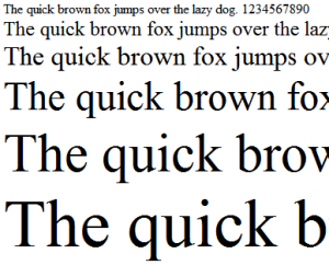
Few fonts are as ubiquitous and widely accepted as Times New Roman. So ubiquitous in fact, that it is not unusual to see Times offered up as the default serif typeface for many word processors and other programs that handle type.

Commissioned by the British newspaper The Times in 1931 after designer and typographer Stanley Morison criticized the publication for being "typographically antiquated," Times New Roman was drawn by Victor Lardent under Morison's supervision for the Monotype Corporation. It was first used in the October 3, 1932 edition of The Times and released for commercial sale in 1933. The Times would use this typeface for the next forty years.

Topics: Typography

Futura, the forward thinking font

Brian Coale

You know a typeface is special when it has been around as long as Futura has, and is still considered modern and "forward thinking." Although Futura is somewhat retro-futuristic these days, kind of like Lost in Space or Star Trek the Original Series, it still somehow manages to conjure feelings of progress and forward movement — a perfect fit for the Industrial Age.

Topics: Typography

Arial, the controversial sans serif

Brian Coale

Nearly ubiquitous since the early 80's, Arial's pervasiveness is the stuff of font legend. A neutral sans serif typeface originally based on Monotype Grotesque, Arial has firmly established itself as the de-facto stand in for Helvetica, much to the chagrin of the design community at large.

Designed in 1982 for Monotype Typography by a team of ten led by Robin Nicholas and Patricia Saunders, Arial was originally designed for the IBM 3800-3 laserxerographic printer. Arial has also shipped with every version of Microsoft Windows since version 3.1 (released in 1992). Apple, who opted to use Helvetica for it's default font, did not ship with Arial until OS X (released in 2002).

Topics: Content Management

Content Management Systems: The Future of Web Design

Brian Coale

Let's face it, Content Managements Systems have had a shaky and inconsistent past. They historically have been notoriously difficult to update and use, and they segment the fluidity of a website into widgets, modules and other boxy containers that tend to compromise a web designer's artistic vision. They also feature rigid templates that are at times freakishly complex and extremely difficult to modify. Add to this the sheer number of Content Management Systems, each with their own learning curve, focus and contributors, and what you have is a complete mess.

Topics: Typography

Helvetica, the Timeless Font

Brian Coale

The workhorse Sans Serif of the 60's and 70's, and still widely used today, Helvetica is the typeface to which all other Sans Serif typefaces are compared (a fact that has caused both praise and consternation in the design community).

First developed in 1957 by Max Miedinger and Eduard Hoffmann at the Haas type foundry (Haas’sche Schriftgiesserei), Helvetica was designed to be an everyday typeface with exceptional legibility that could be used for a great variety of applications. Helvetica was based largely on the Akzidenz-Grotesk typeface, and is technically considered to be in the "sans serif Grotesque" family of typefaces, along with Haettenschweiler, Folio, Franklin Gothic, Eurostile, Geneva and many others.