LEARNING CENTER

Articles, Training, Videos, Tips, eBooks, and More!

Subscribe ›
Topics: Typography

Arial, the controversial sans serif

Brian Coale

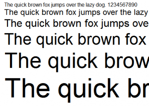
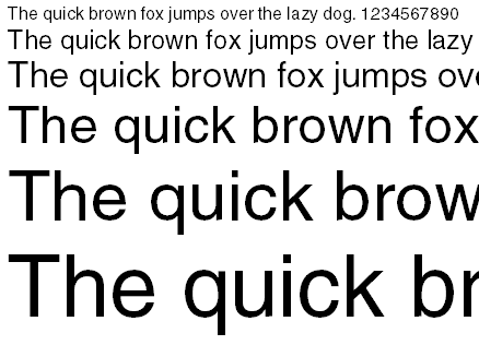
Nearly ubiquitous since the early 80's, Arial's pervasiveness is the stuff of font legend. A neutral sans serif typeface originally based on Monotype Grotesque, Arial has firmly established itself as the de-facto stand in for Helvetica, much to the chagrin of the design community at large.

Designed in 1982 for Monotype Typography by a team of ten led by Robin Nicholas and Patricia Saunders, Arial was originally designed for the IBM 3800-3 laserxerographic printer. Arial has also shipped with every version of Microsoft Windows since version 3.1 (released in 1992). Apple, who opted to use Helvetica for it's default font, did not ship with Arial until OS X (released in 2002).

Topics: Typography

Helvetica, the Timeless Font

Brian Coale

The workhorse Sans Serif of the 60's and 70's, and still widely used today, Helvetica is the typeface to which all other Sans Serif typefaces are compared (a fact that has caused both praise and consternation in the design community).

First developed in 1957 by Max Miedinger and Eduard Hoffmann at the Haas type foundry (Haas’sche Schriftgiesserei), Helvetica was designed to be an everyday typeface with exceptional legibility that could be used for a great variety of applications. Helvetica was based largely on the Akzidenz-Grotesk typeface, and is technically considered to be in the "sans serif Grotesque" family of typefaces, along with Haettenschweiler, Folio, Franklin Gothic, Eurostile, Geneva and many others.

Topics: Typography

Caslon, when in doubt, use Caslon

Brian Coale

One of my favorite fonts, and a beautiful work that has stood the test of time.

Cited as the first original typeface of English origin, Caslon is a serif typeface that was designed by William Caslon I (1692–1766) in 1722. Sharing the irregularity characteristics of Dutch Baroque types, Caslon is characterized by short ascenders and descenders, bracketed serifs, moderately high contrast, robust texture, and moderate modulation of stroke.

Type historians Stanley Morison and Alfred F. Johnson, a scientist who worked at the British Museum, point out the close similarity of Caslon's design to the Dutch Fell types cut by Voskens and other type cut by the Dutchman Van Dyck.

Topics: Typography

Comic Sans, Love It or Hate It

Brian Coale

One of the most hated, and loved, and most used fonts in typography could arguably be Comic Sans. The bane of just about every professional designer and Prepress technician in the world, this font is the subject of at least one joke every week here at Casey. So it seemed the perfect for a blog post about fonts.

When Microsoft designer Vincent Connare began work on Comic Sans in October 1994, he wanted to create a typeface based on the lettering in popular comic books such as The Watchmen and The Dark Knight Returns. It first appeared in Microsoft 3D Movie Maker, and later shipped with the Windows 95 Plus! Pack.

Topics: Design Tips & Tricks tips and tricks Typography

Correct Usage of Quotes

Jasper


In a recent typography class, I had the opportunity to learn about typographers quotes. Although the type of quote that is used is a fairly minor component of a document, using the correct type of quotes is an easy way to make sure that your document is the best that it can be.

The most important thing to remember when you are using quotes within a document is that 66 comes before 99. This means that the opening quotes should be the ones that look like a 66 and the closing quotes should look like a 99.