LEARNING CENTER

Articles, Training, Videos, Tips, eBooks, and More!

Subscribe ›
Topics: Design Typography Print

Points vs Picas - Understanding Common Print Measurements

Brian Coale

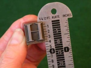
Picas, pronounced PIE - KAH, are a typographic measuring system developed in 1785 by François-Ambroise “L'éclat” Didot that replaced the traditional cicéro measurement system. Comprised of 12 “Points,” Picas are still the standard measuring system for typography today, but many designers still prefer to use more widely accepted measurements such as inches and millimeters. So today we'll try to answer the question: What are Points and Picas - and what's the difference?

Topics: Design Tips & Tricks tips and tricks Typography

Correct Usage of Quotes

Jasper


In a recent typography class, I had the opportunity to learn about typographers quotes. Although the type of quote that is used is a fairly minor component of a document, using the correct type of quotes is an easy way to make sure that your document is the best that it can be.

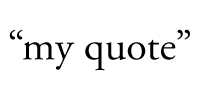
The most important thing to remember when you are using quotes within a document is that 66 comes before 99. This means that the opening quotes should be the ones that look like a 66 and the closing quotes should look like a 99.

Topics: Adobe Design Design Tips Tips & Tricks tips and tricks

How should I size my images?

Jasper

One of the most common mistakes that people make when they are preparing images for print is that they incorrectly size their images. Making sure that your image's size and resolution match is one of the easiest ways to ensure that your project will look its absolute best.

When you are preparing pictures for publication, it is important to think about how it will be reproduced. The two different methods that I usually use are print and internet.

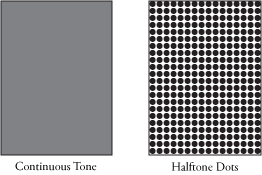
Images destined for the internet are simple. Computer screen images are made up of little red, green, and blue dots that are placed right next to each other. There are 72 rows of these dots per inch, and therefore a 72 dpi image is sufficient for the web, or any other graphic that stays on your computer.

Topics: Adobe Design Design Tips tips and tricks

How to Use Paragraph Styles in InDesign

Ryan Casey

Last week I was asked to help out teaching Adobe InDesign at King City High School. I was trying to figure out what the most valuable features of the software could be for a high school and then it came to me - styles.

I think that styles are some of the most under-utilized features of Adobe InDesign, however they are really easy to set up and even easier to use. In this post, I will show you the basics of how to use paragraph styles in InDesign.

A great way to learn how to use styles is to create a mock document. To demonstrate, I will create a layout for a very basic newsletter page. Hopefully by following the steps below, you will have a better understanding of how styles work. Of course if you have any questions, or need help building your design, you can get answers by hitting that "Talk to an Expert" button below.

Talk to an Expert ›