LEARNING CENTER

Articles, Training, Videos, Tips, eBooks, and More!

Subscribe ›
Topics: Typography

Eurostile, the Space Age font

Brian Coale

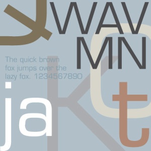
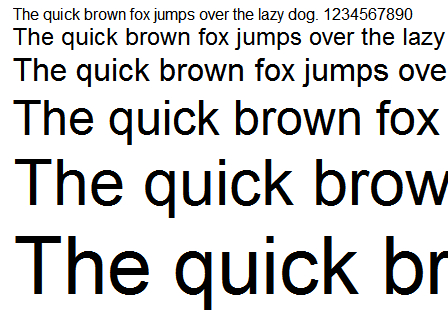
A child of the Space Race and a perfect representation of it's time, Eurostile is an acutely distinctive font with a characteristically chic and sophisticated appearance.

Designed in 1962 by Aldo Novarese for the popular Nebiolo type foundry in Italy, Eurostile was based on Novarese's earlier work Microgamma. While Microgamma featured only capital letters, Eurostile included upper and lower case letters, bold condensed variants, and the ultra-narrow Eurostile Compact variant. In all, the original Eurostile family contained seven fonts.

Topics: Typography

Goudy Old Style, the Graceful Typeface

Brian Coale

One typeface that has greatly inspired my love for typography over the years is Goudy Old Style. Elegant and stately, Goudy Old Style is a fine choice for any creative that that requires an ambiance of beauty and nobility.

Goudy Old Style was created by Frederic W. Goudy in 1915 on behalf of the American Type Founders, a business trust created in 1892 by the merger of 23 type foundries, representing about 85% of all type manufactured in the United States.

Topics: Typography

Times New Roman, the newspaper font

Brian Coale

Few fonts are as ubiquitous and widely accepted as Times New Roman. So ubiquitous in fact, that it is not unusual to see Times offered up as the default serif typeface for many word processors and other programs that handle type.

Commissioned by the British newspaper The Times in 1931 after designer and typographer Stanley Morison criticized the publication for being "typographically antiquated," Times New Roman was drawn by Victor Lardent under Morison's supervision for the Monotype Corporation. It was first used in the October 3, 1932 edition of The Times and released for commercial sale in 1933. The Times would use this typeface for the next forty years.

Topics: Typography

Futura, the forward thinking font

Brian Coale

You know a typeface is special when it has been around as long as Futura has, and is still considered modern and "forward thinking." Although Futura is somewhat retro-futuristic these days, kind of like Lost in Space or Star Trek the Original Series, it still somehow manages to conjure feelings of progress and forward movement — a perfect fit for the Industrial Age.

Topics: Typography

Arial, the controversial sans serif

Brian Coale

Nearly ubiquitous since the early 80's, Arial's pervasiveness is the stuff of font legend. A neutral sans serif typeface originally based on Monotype Grotesque, Arial has firmly established itself as the de-facto stand in for Helvetica, much to the chagrin of the design community at large.

Designed in 1982 for Monotype Typography by a team of ten led by Robin Nicholas and Patricia Saunders, Arial was originally designed for the IBM 3800-3 laserxerographic printer. Arial has also shipped with every version of Microsoft Windows since version 3.1 (released in 1992). Apple, who opted to use Helvetica for it's default font, did not ship with Arial until OS X (released in 2002).

Topics: Content Management

Content Management Systems: The Future of Web Design

Brian Coale

Let's face it, Content Managements Systems have had a shaky and inconsistent past. They historically have been notoriously difficult to update and use, and they segment the fluidity of a website into widgets, modules and other boxy containers that tend to compromise a web designer's artistic vision. They also feature rigid templates that are at times freakishly complex and extremely difficult to modify. Add to this the sheer number of Content Management Systems, each with their own learning curve, focus and contributors, and what you have is a complete mess.

Topics: Typography

Helvetica, the Timeless Font

Brian Coale

The workhorse Sans Serif of the 60's and 70's, and still widely used today, Helvetica is the typeface to which all other Sans Serif typefaces are compared (a fact that has caused both praise and consternation in the design community).

First developed in 1957 by Max Miedinger and Eduard Hoffmann at the Haas type foundry (Haas’sche Schriftgiesserei), Helvetica was designed to be an everyday typeface with exceptional legibility that could be used for a great variety of applications. Helvetica was based largely on the Akzidenz-Grotesk typeface, and is technically considered to be in the "sans serif Grotesque" family of typefaces, along with Haettenschweiler, Folio, Franklin Gothic, Eurostile, Geneva and many others.

Topics: Typography

Caslon, when in doubt, use Caslon

Brian Coale

One of my favorite fonts, and a beautiful work that has stood the test of time.

Cited as the first original typeface of English origin, Caslon is a serif typeface that was designed by William Caslon I (1692–1766) in 1722. Sharing the irregularity characteristics of Dutch Baroque types, Caslon is characterized by short ascenders and descenders, bracketed serifs, moderately high contrast, robust texture, and moderate modulation of stroke.

Type historians Stanley Morison and Alfred F. Johnson, a scientist who worked at the British Museum, point out the close similarity of Caslon's design to the Dutch Fell types cut by Voskens and other type cut by the Dutchman Van Dyck.

Topics: Typography

Comic Sans, Love It or Hate It

Brian Coale

One of the most hated, and loved, and most used fonts in typography could arguably be Comic Sans. The bane of just about every professional designer and Prepress technician in the world, this font is the subject of at least one joke every week here at Casey. So it seemed the perfect for a blog post about fonts.

When Microsoft designer Vincent Connare began work on Comic Sans in October 1994, he wanted to create a typeface based on the lettering in popular comic books such as The Watchmen and The Dark Knight Returns. It first appeared in Microsoft 3D Movie Maker, and later shipped with the Windows 95 Plus! Pack.

Topics: Design Tips File Preparation General Info Tips & Tricks

Why JPEGs are Bad for Print

Brian Coale

When it comes to images, JPEGs are the undisputed king of the hill. With roughly 70% of websites using JPEGs and most digital cameras and camcorders, including the ones on smart phones and tablets, JPEGs have a huge market share on the Internet and with electronic devices that use images. The advantages of this file format, particularly on the web or devices with limited internal memory, is that they offer a decent image quality with an impressive reduction in file size.

So why doesn't your printer like them? Why do they roll their eyes and make a face at the mere mention of this useful and nearly ubiquitous file format?