LEARNING CENTER

Articles, Training, Videos, Tips, eBooks, and More!

Subscribe ›
Brian Coale

Brian Coale

Creative Director / Marketing Manager for Casey Printing

Recent Posts by Brian Coale:

Topics: Design Tips

Avoid the Lemonheads: Proper Scaling & Cropping of Images

Brian Coale

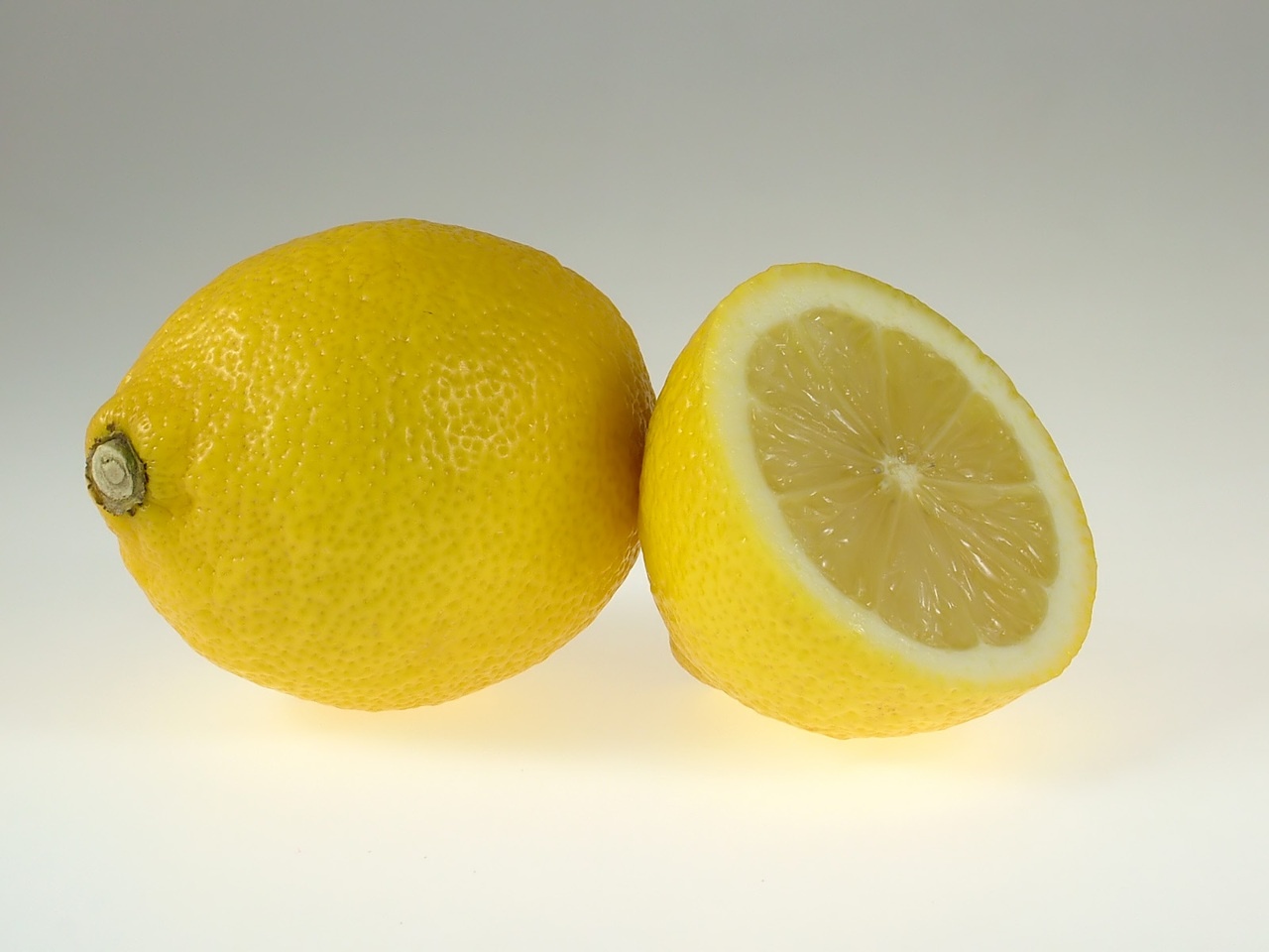
OK we've all done it. You have an image you really want to use for your website, blog or print project but it's either too tall or too wide. Still, you really want to use it, so you force it to fit anyway by using the Free Transform tool in Photoshop, or Fit to Frame in InDesign, or one of the many other image resizing tools out there. It fits, so your perfect layout is not compromised, and you go happily on your way. Soon the feedback starts: "Why does his head look like a football," "Why do I look so fat in that picture," "Why does she look squished?" That's when you realize somethings wrong.

You've had an attack of the Lemonheads.

Topics: File Preparation

Designing Type for Print in Photoshop

Brian Coale

Let's face it, everyone has different skills. One person may be great at playing guitar, but not know how to turn on a computer, while another might be great at programming, but not know how to play a single chord. As humans, we like to play to our strengths and work with what we know. This is why since I've been in the Printing & Publishing industry, I've seen a number of different types of job files come through the door, From PDFs to JPEGs, and InDesign to Word. Some are great to work with, while others can be problematical. One program that can regularly cause headaches for both you and your printer is Adobe Photoshop.

Let's go ahead and get it out there: Photoshop is not a layout program! It is intended to edit photographs and images, hence the name.

Topics: Typography

Linux Libertine, the Open Alternative

Brian Coale

Designed as an open source alternative to commonly used proprietary fonts such as Times Roman, Linux Libertine is one of the few completely free and truly open-sourced font families in existence, and also one of the most popular. From start to finish, Linux Libertine is the apex of open sourced: from its creation in Font Forge (the free font editor) to it's GNU General Public and SIL Open Font Licenses.

Designed by the Libertine Open Fonts Project and released in July of 2012, both Linux Libertine and Linux Biolinum were bundled with LibreOffice, the default office suite in many Linux Distributions such as Ubuntu, Fedora, OpenSUSE and Linux Mint. Despite being a freely available and relatively new typeface, Linux Libertine boasts an impressive 2,000+ glyphs encompassing the Greek, Cryllic and Hebrew Alphabets and several ligatures and special characters.

Topics: Mobile Search Engine Optimization

Mobile Ready vs Mobile Optimized - What's the Difference?

Brian Coale

Mobile Friendly. Mobile Ready. Mobile Optimized. These words get thrown around a lot when talking about web design, with little or no explanation as to what the words really mean. That's because they are basically buzzwords designed to sell web design services.  Google any of these terms and you'll find many explanations provided by articles and blogs like this one, but not many clear definitions. Web designers typically use words like these to describe a website that works better on mobile than it did before you procured their services.

Topics: Typography

Cooper Black, the far-sighted font for near-sighted readers.

Brian Coale

Widely used in the 1920's to 1930's, and considered somewhat iconic of the 1970's in modern times, Cooper Black is an old style serif font based upon Cooper Old Style.

Designed by Oswald Bruce Cooper in 1921, Cooper Black was released by the Barnhart Brothers & Spindler type foundry in 1922. Advertised as being "for far-sighted printers with near-sighted customers," Cooper Black was dubbed "The Black Menace" by it's critics. Cooper Black inspired many imitations, but none enjoyed the popularity of the original.

Topics: Typography

Garamond, the Eco-Friendly Font

Brian Coale

A highly popular and much-emulated font, Garamond represents a group of old-style serif typefaces named after Claude Garamond.

Claude Garamond was a punchcutter who cut types for the Parisian printer Robert Estienne in the early sixteenth century. He based his romans on those designed by Francesco Griffo, who cut type for the Venetian printer Aldus Manutius in 1495. After Claude Garamond died in 1561, his punches were sold to the printing office of Christoph Plantin in Antwerp, where they were used for several decades. A complete set of the original Garamond dies and matrices is still on display at the Plantin-Moretus museum even today.

Topics: Typography

Eurostile, the Space Age font

Brian Coale

A child of the Space Race and a perfect representation of it's time, Eurostile is an acutely distinctive font with a characteristically chic and sophisticated appearance.

Designed in 1962 by Aldo Novarese for the popular Nebiolo type foundry in Italy, Eurostile was based on Novarese's earlier work Microgamma. While Microgamma featured only capital letters, Eurostile included upper and lower case letters, bold condensed variants, and the ultra-narrow Eurostile Compact variant. In all, the original Eurostile family contained seven fonts.

Topics: Typography

Goudy Old Style, the Graceful Typeface

Brian Coale

One typeface that has greatly inspired my love for typography over the years is Goudy Old Style. Elegant and stately, Goudy Old Style is a fine choice for any creative that that requires an ambiance of beauty and nobility.

Goudy Old Style was created by Frederic W. Goudy in 1915 on behalf of the American Type Founders, a business trust created in 1892 by the merger of 23 type foundries, representing about 85% of all type manufactured in the United States.

Topics: Typography

Times New Roman, the newspaper font

Brian Coale

Few fonts are as ubiquitous and widely accepted as Times New Roman. So ubiquitous in fact, that it is not unusual to see Times offered up as the default serif typeface for many word processors and other programs that handle type.

Commissioned by the British newspaper The Times in 1931 after designer and typographer Stanley Morison criticized the publication for being "typographically antiquated," Times New Roman was drawn by Victor Lardent under Morison's supervision for the Monotype Corporation. It was first used in the October 3, 1932 edition of The Times and released for commercial sale in 1933. The Times would use this typeface for the next forty years.

Topics: Typography

Futura, the forward thinking font

Brian Coale

You know a typeface is special when it has been around as long as Futura has, and is still considered modern and "forward thinking." Although Futura is somewhat retro-futuristic these days, kind of like Lost in Space or Star Trek the Original Series, it still somehow manages to conjure feelings of progress and forward movement — a perfect fit for the Industrial Age.